DES303 Week 3: Delivering the Demo & Reflecting on Peers
This week I presented my "Start Your Startup" tech demo and watched my peers deliver theirs. I'm using Gibbs' Reflective Cycle to reflect on the experience of presenting, receiving feedback, and learning from other demos.
Description — What happened?
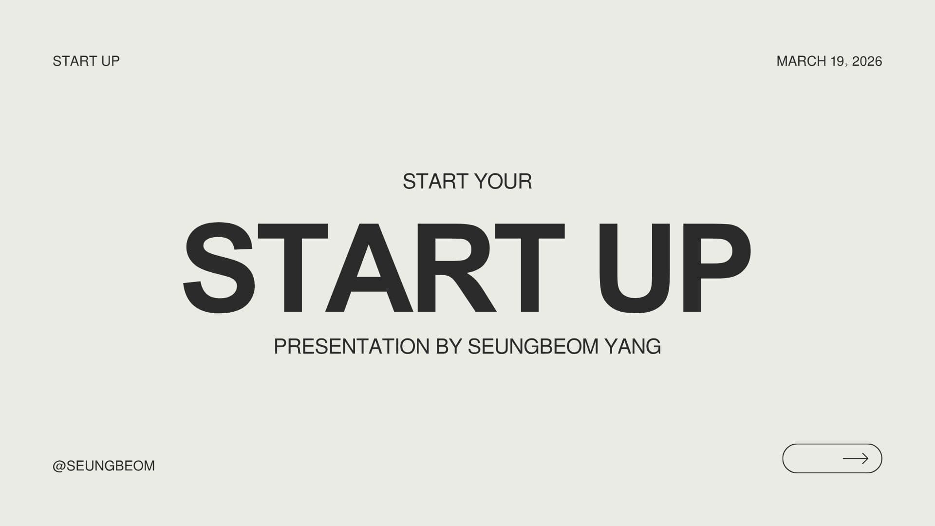
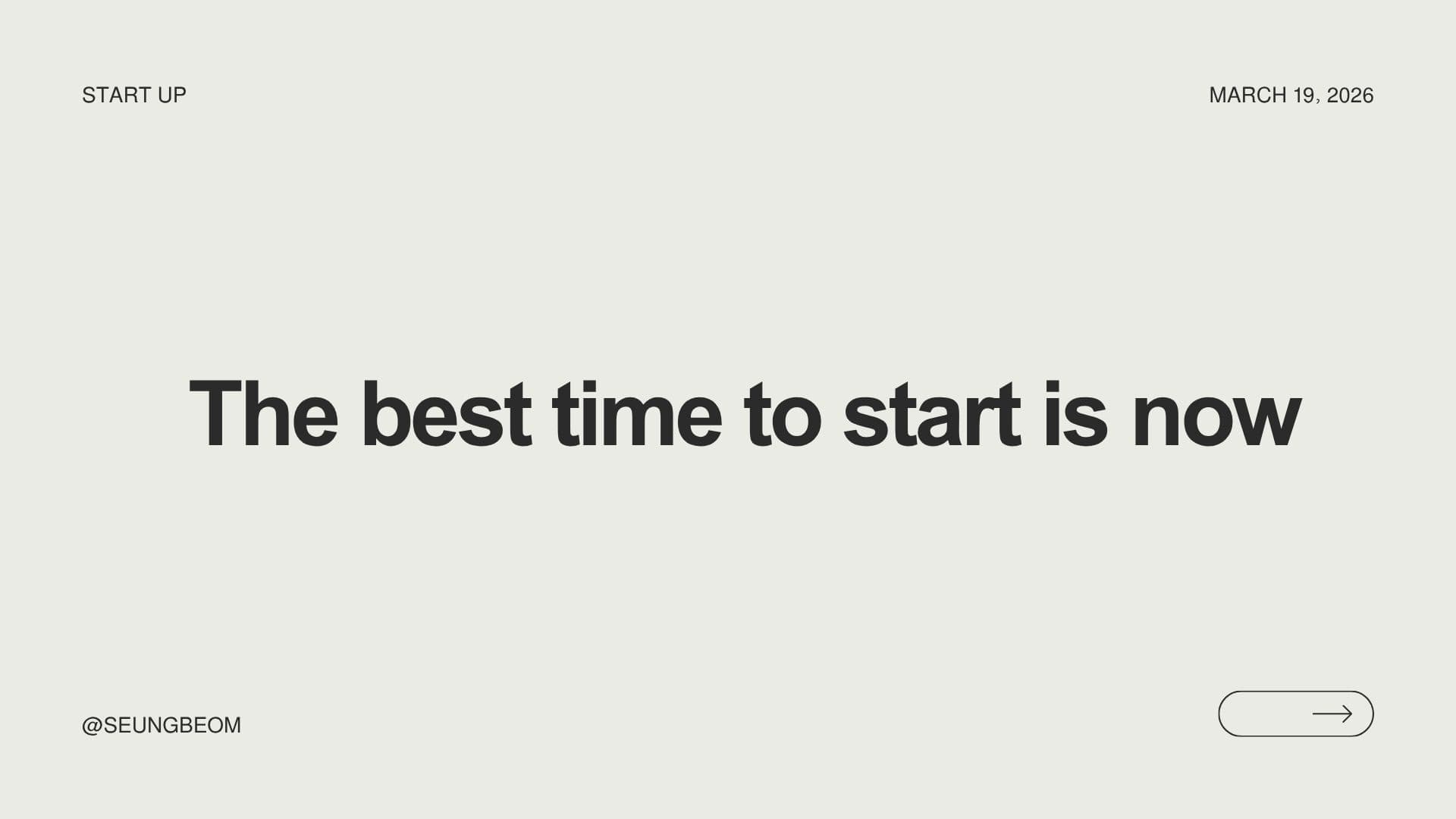
On March 19th, I delivered my "Start Your Startup" presentation to my demo group. The setup was intense — there were 18 groups all presenting in the same space at the same time, with no microphones provided. I was also the first presenter in my group, which meant I had no chance to ease into the session by watching someone else go first. The room was loud, and I had to essentially shout to be heard over the other groups around us.
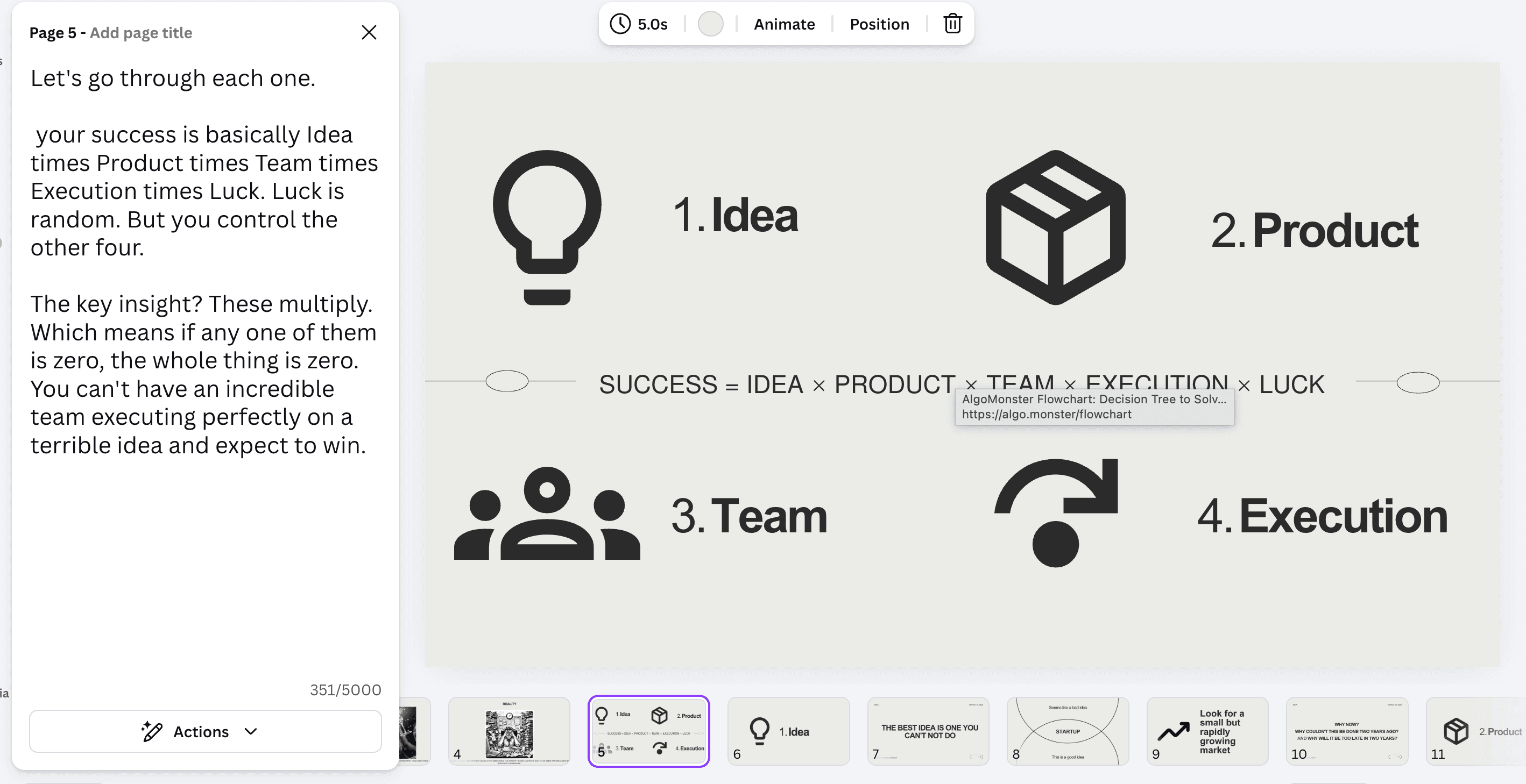
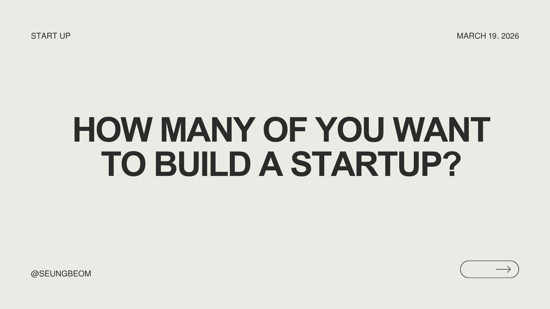
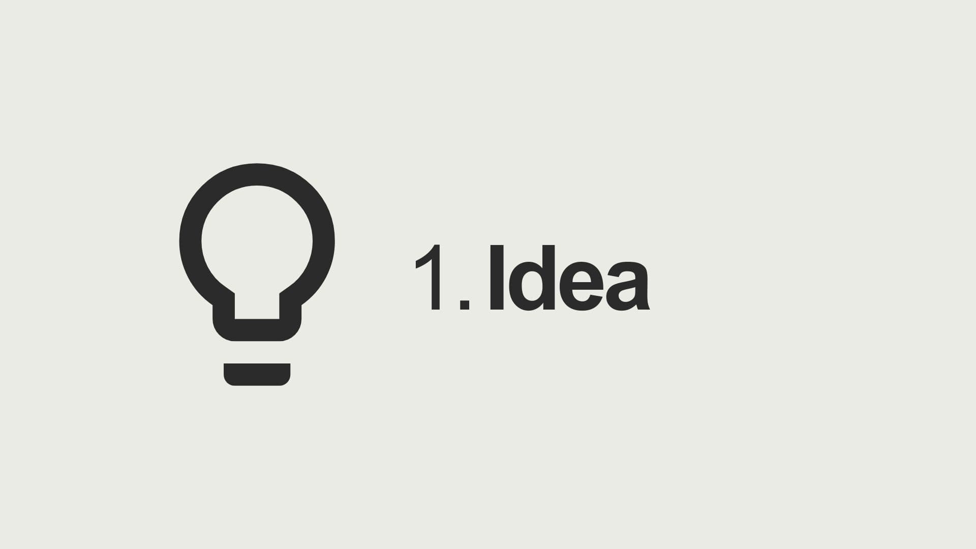
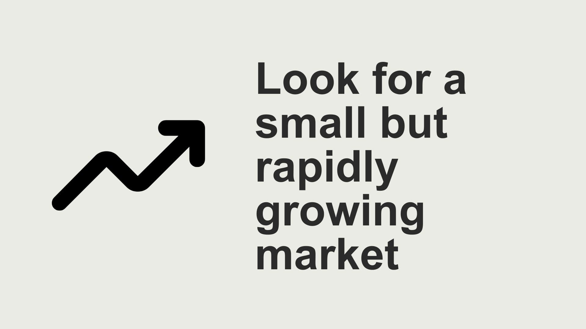
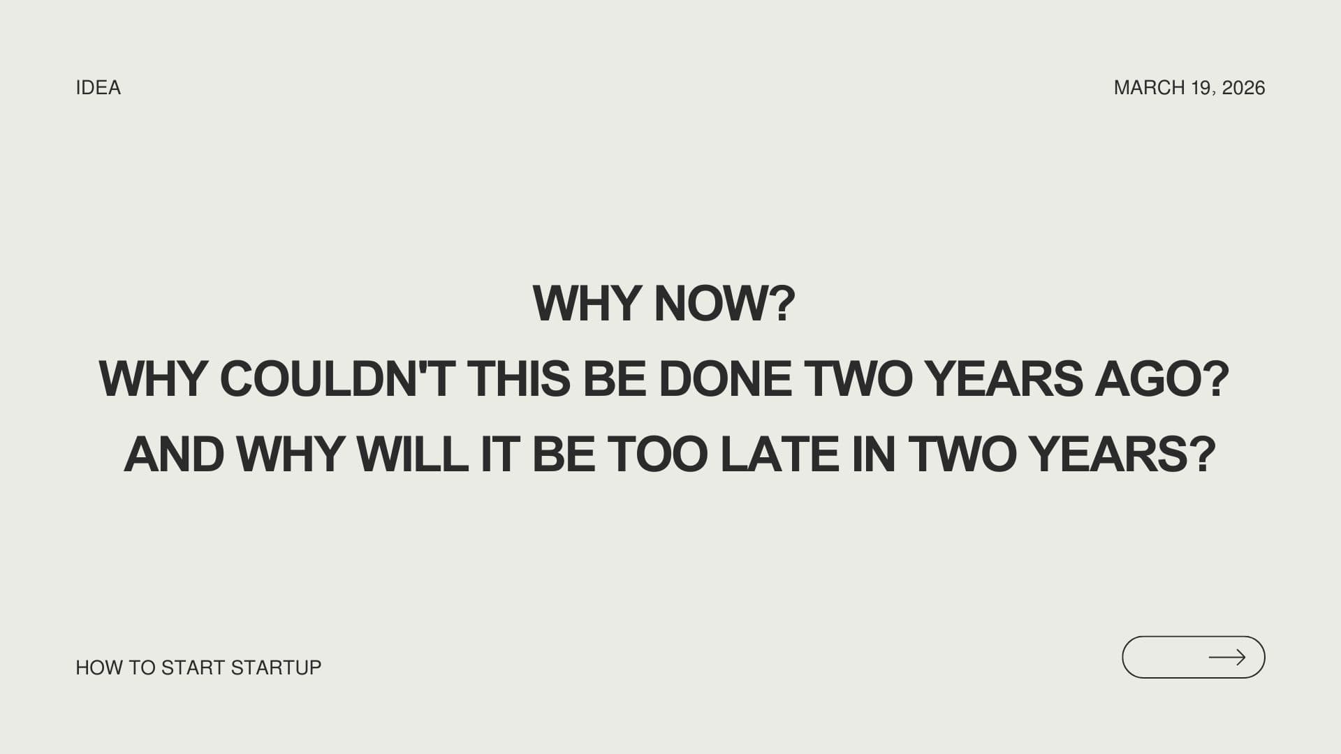
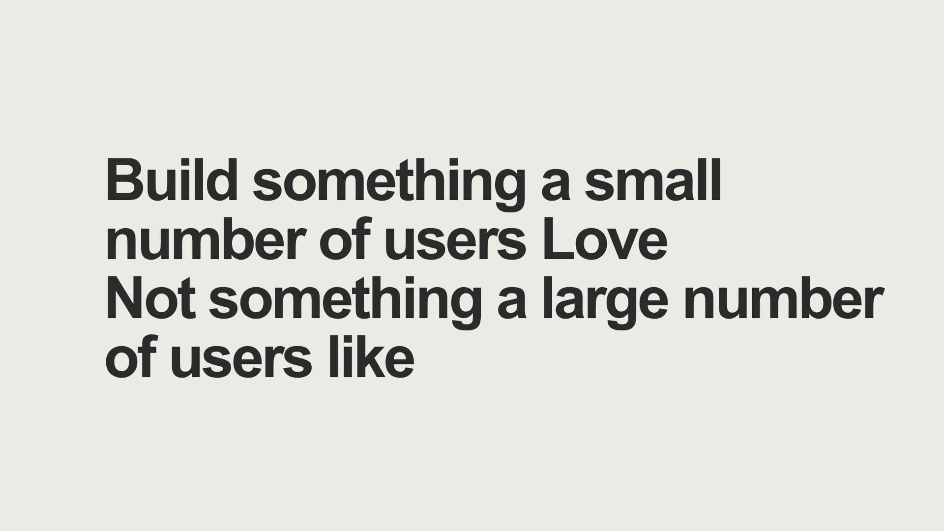
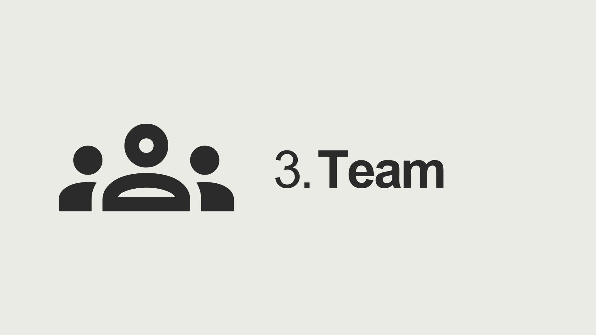
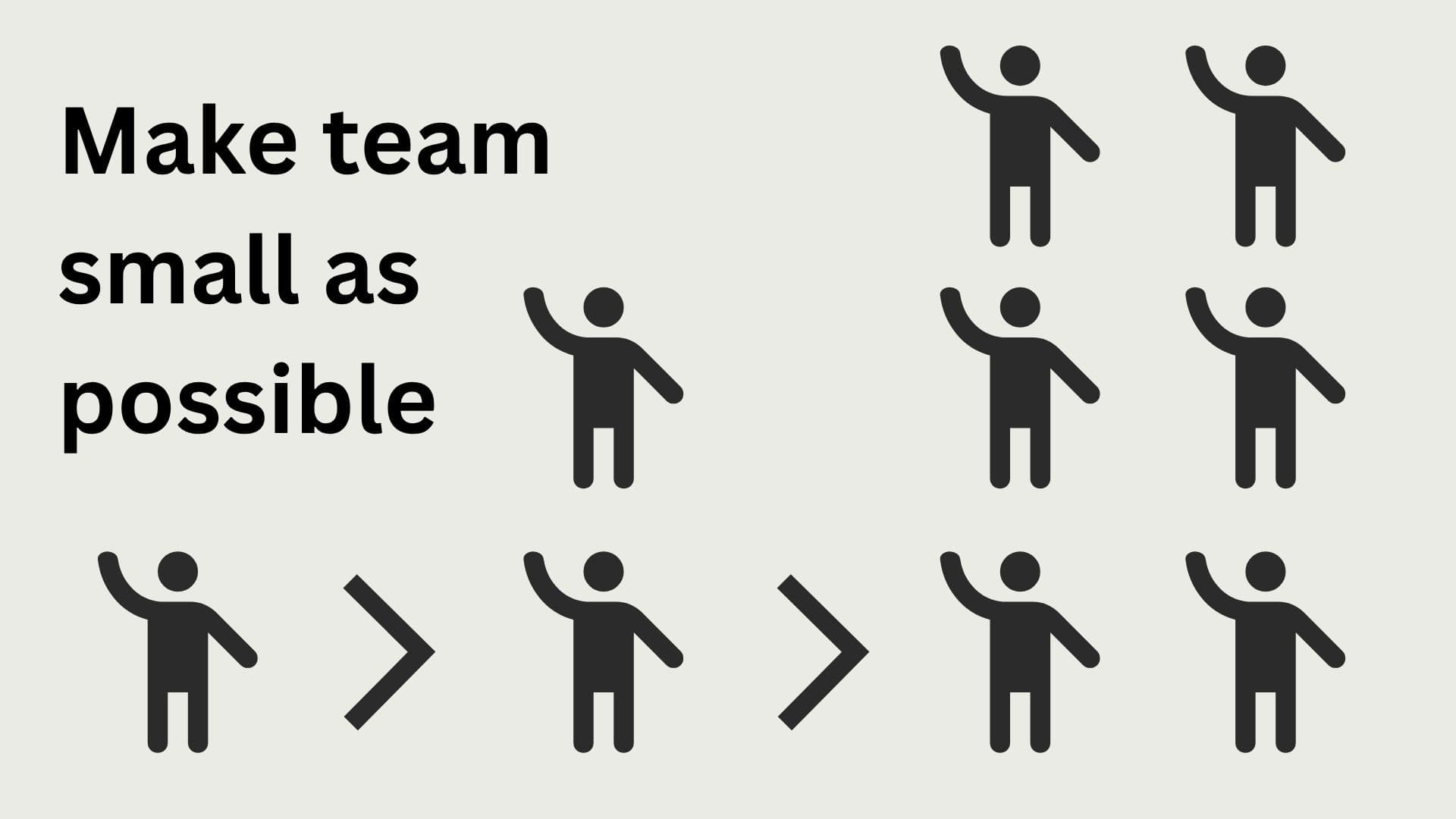
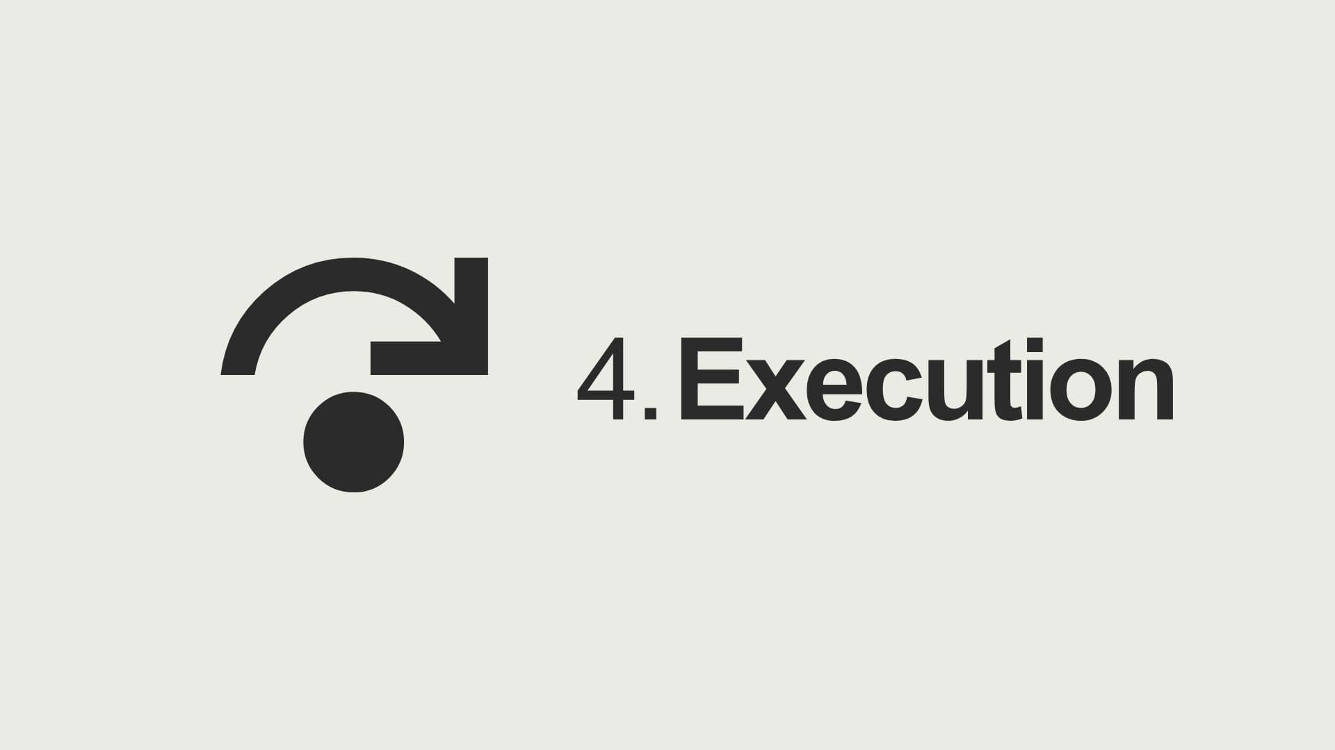
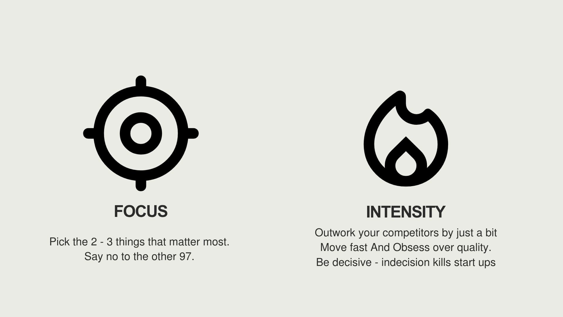
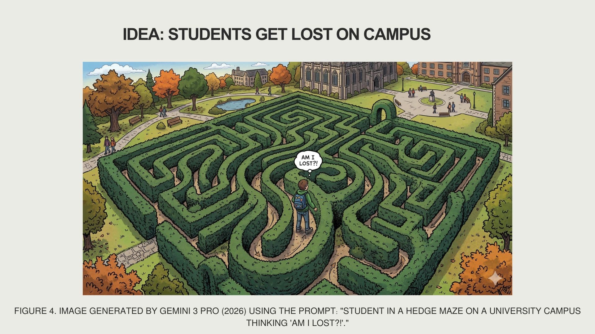
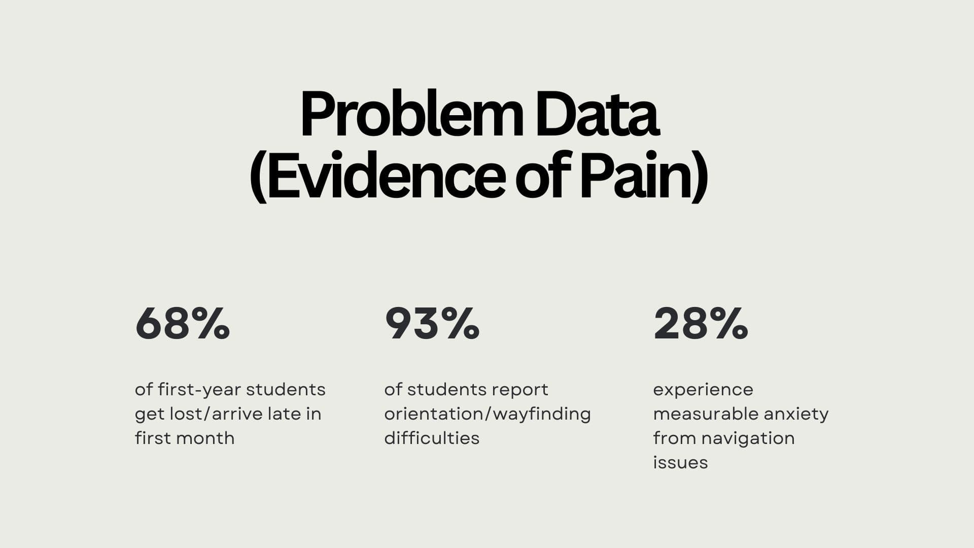
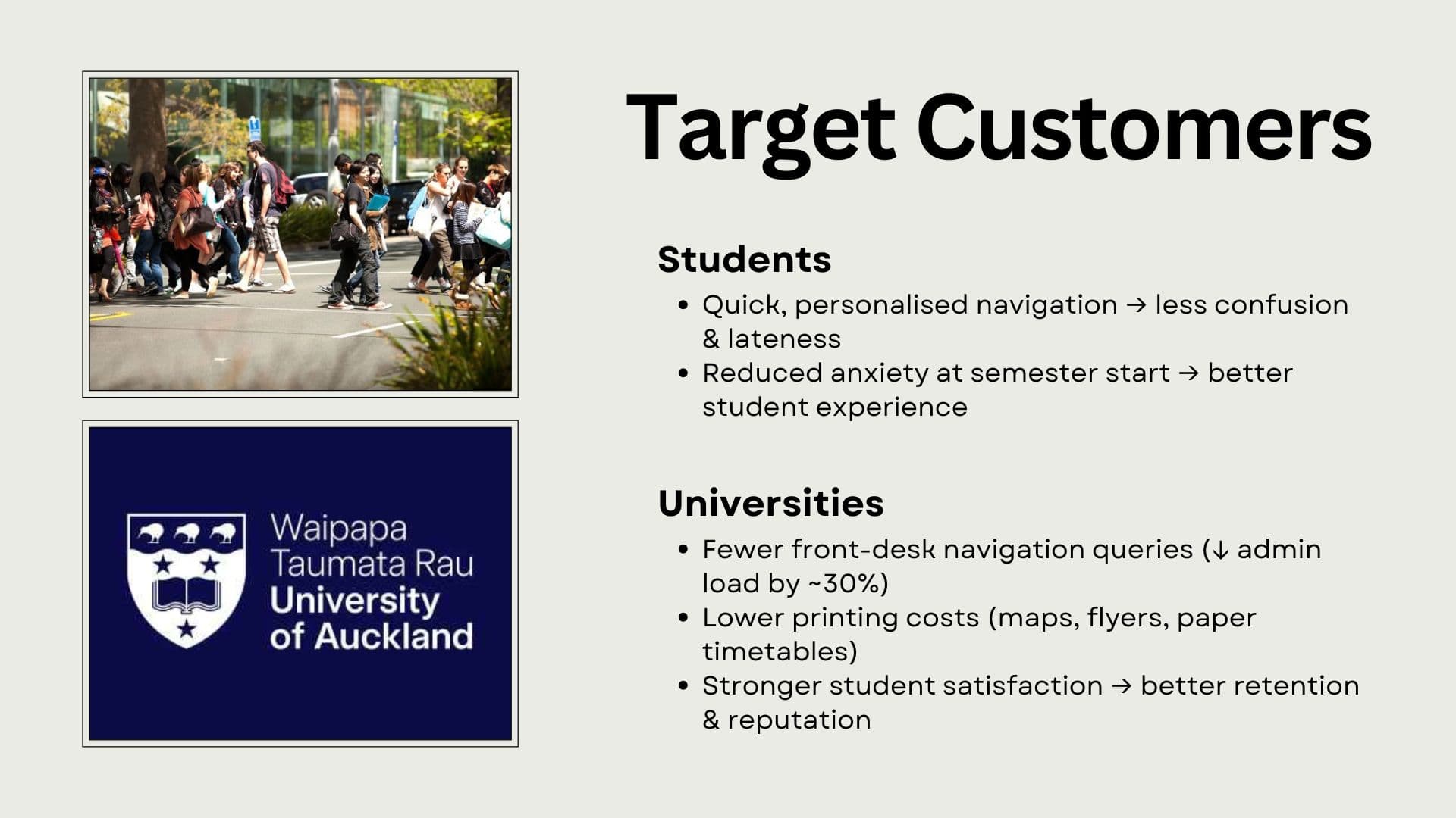
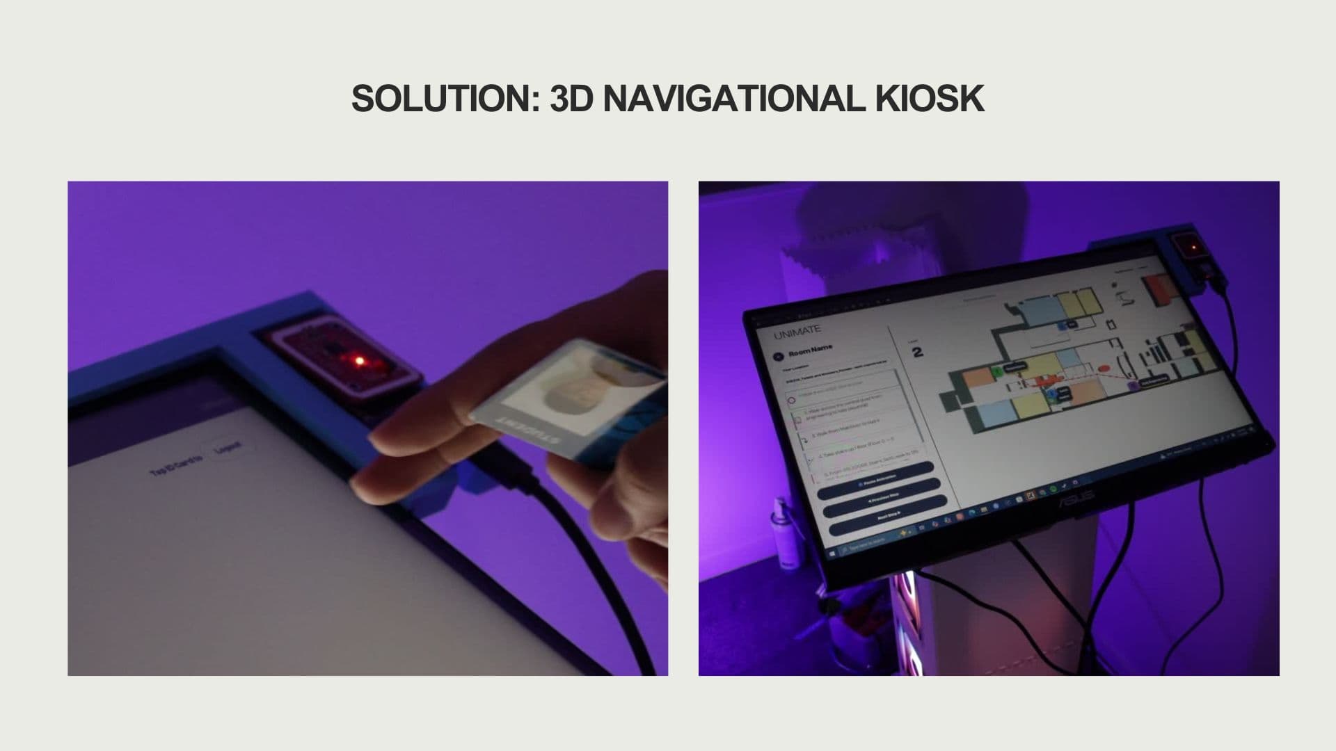
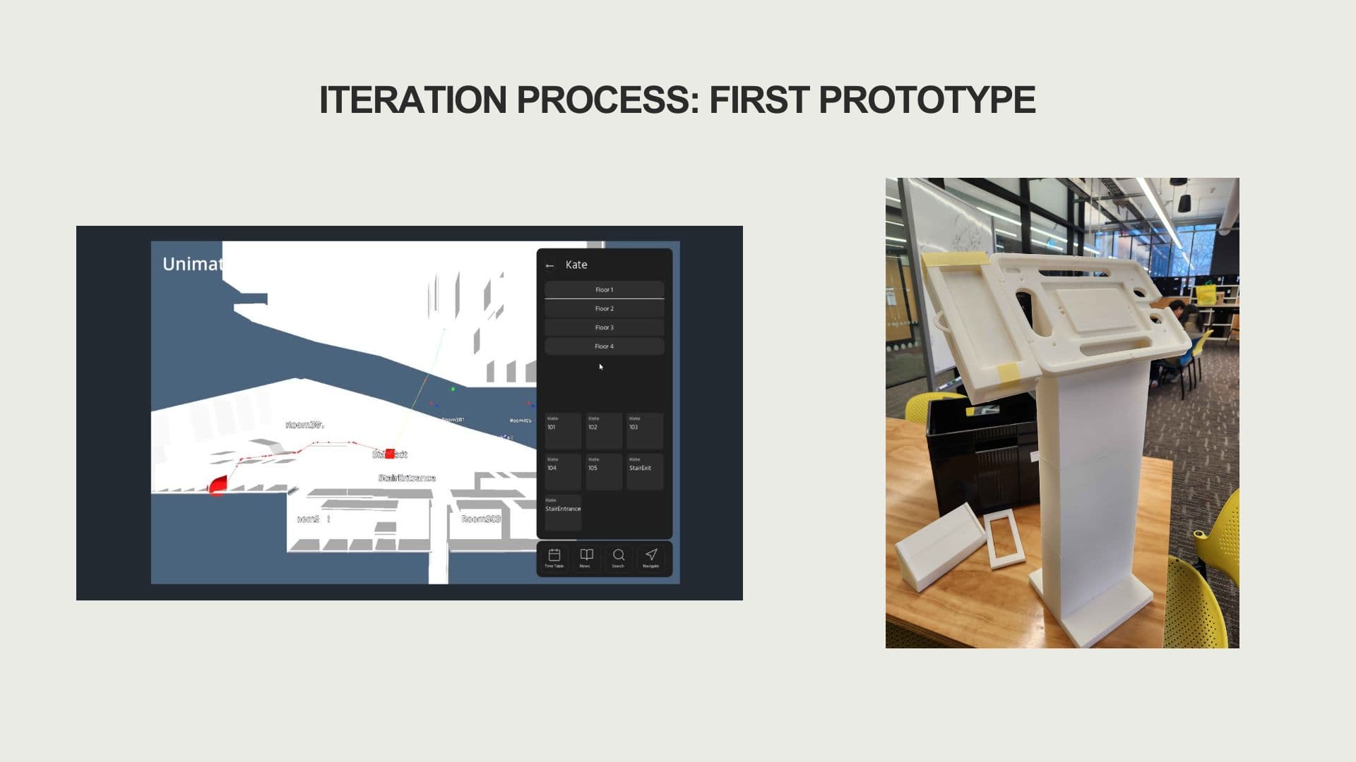
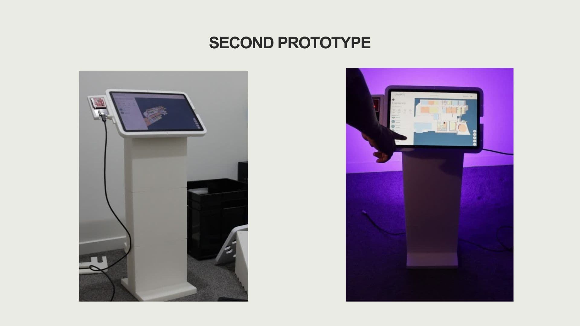
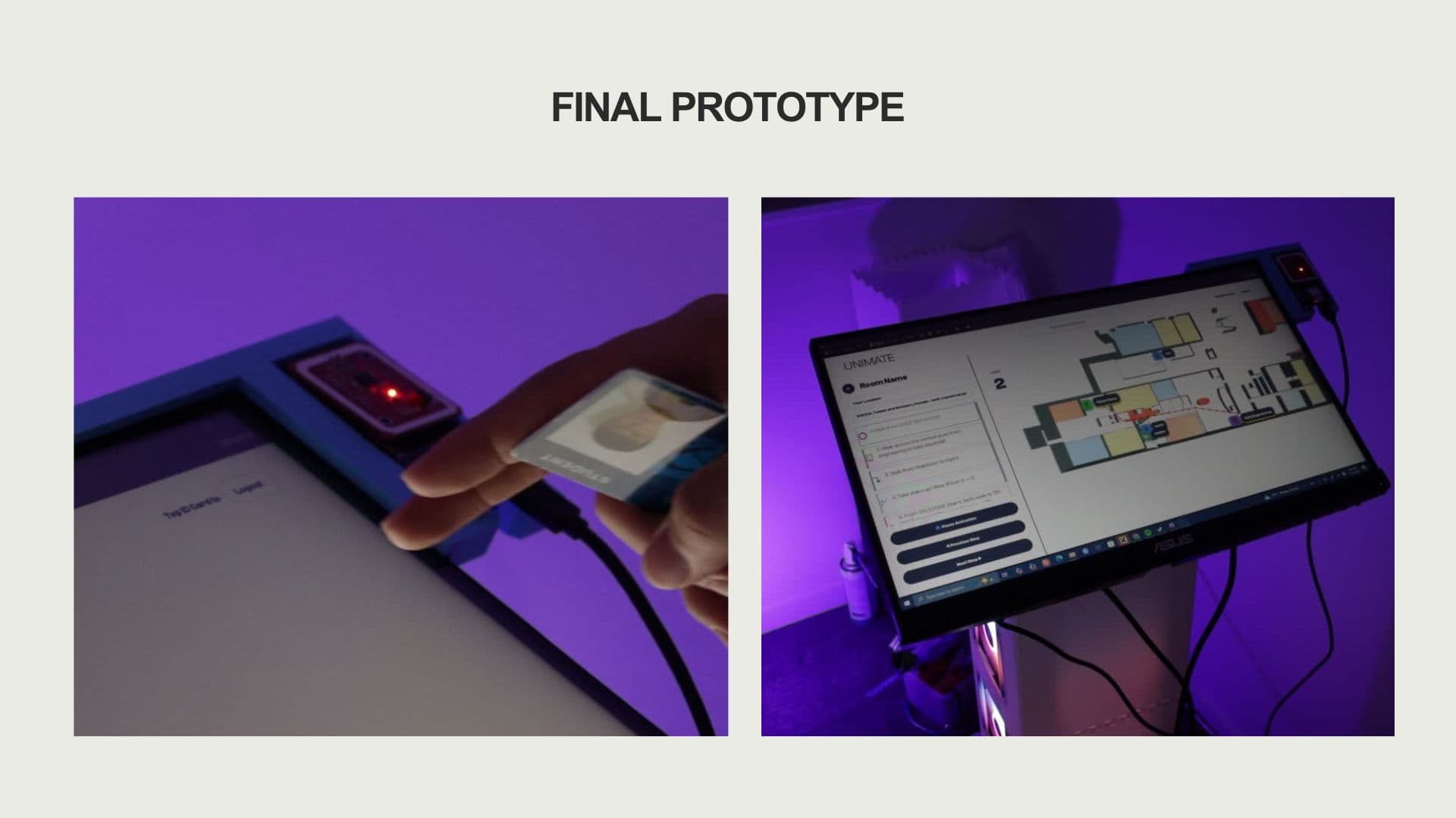
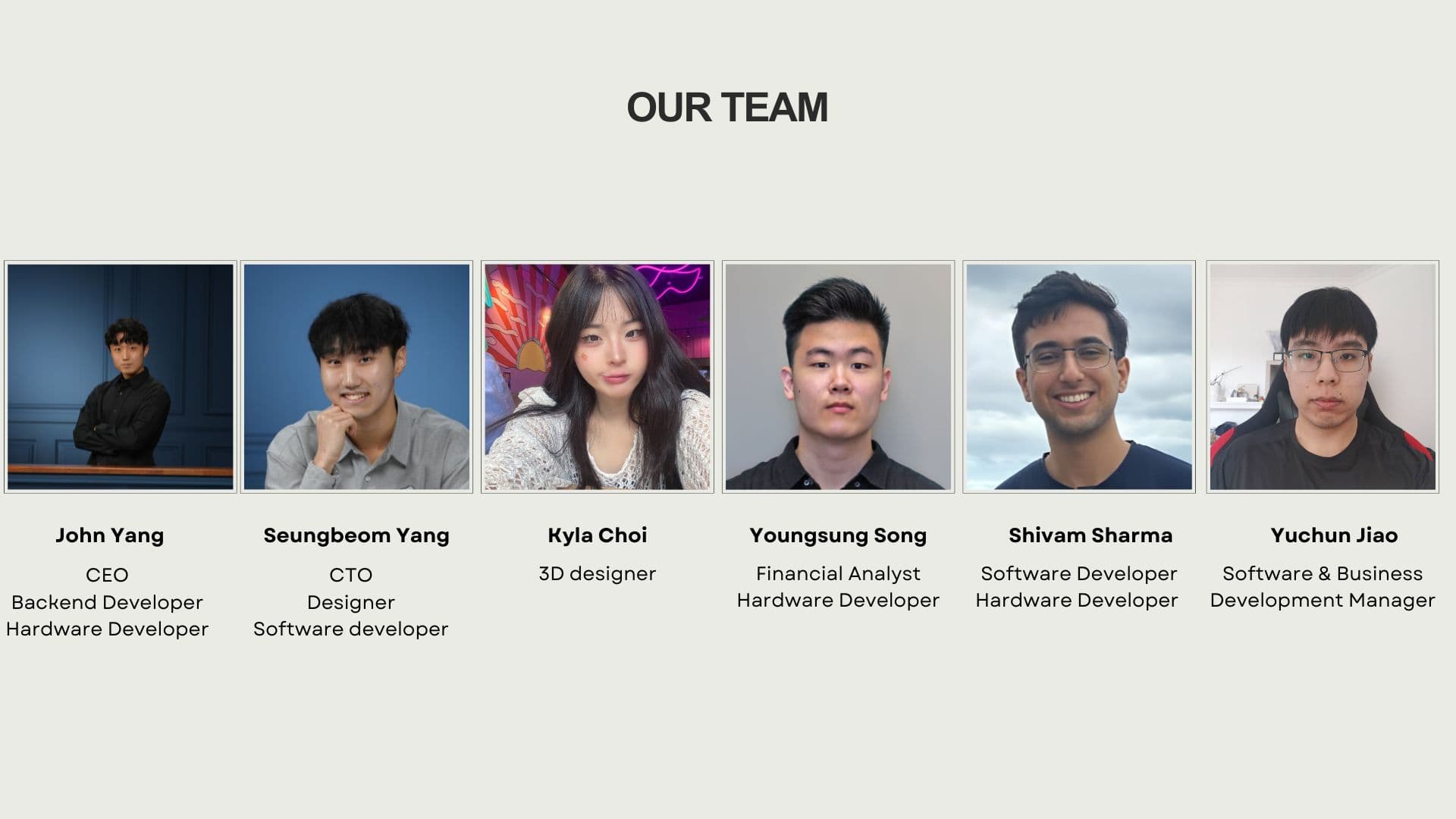
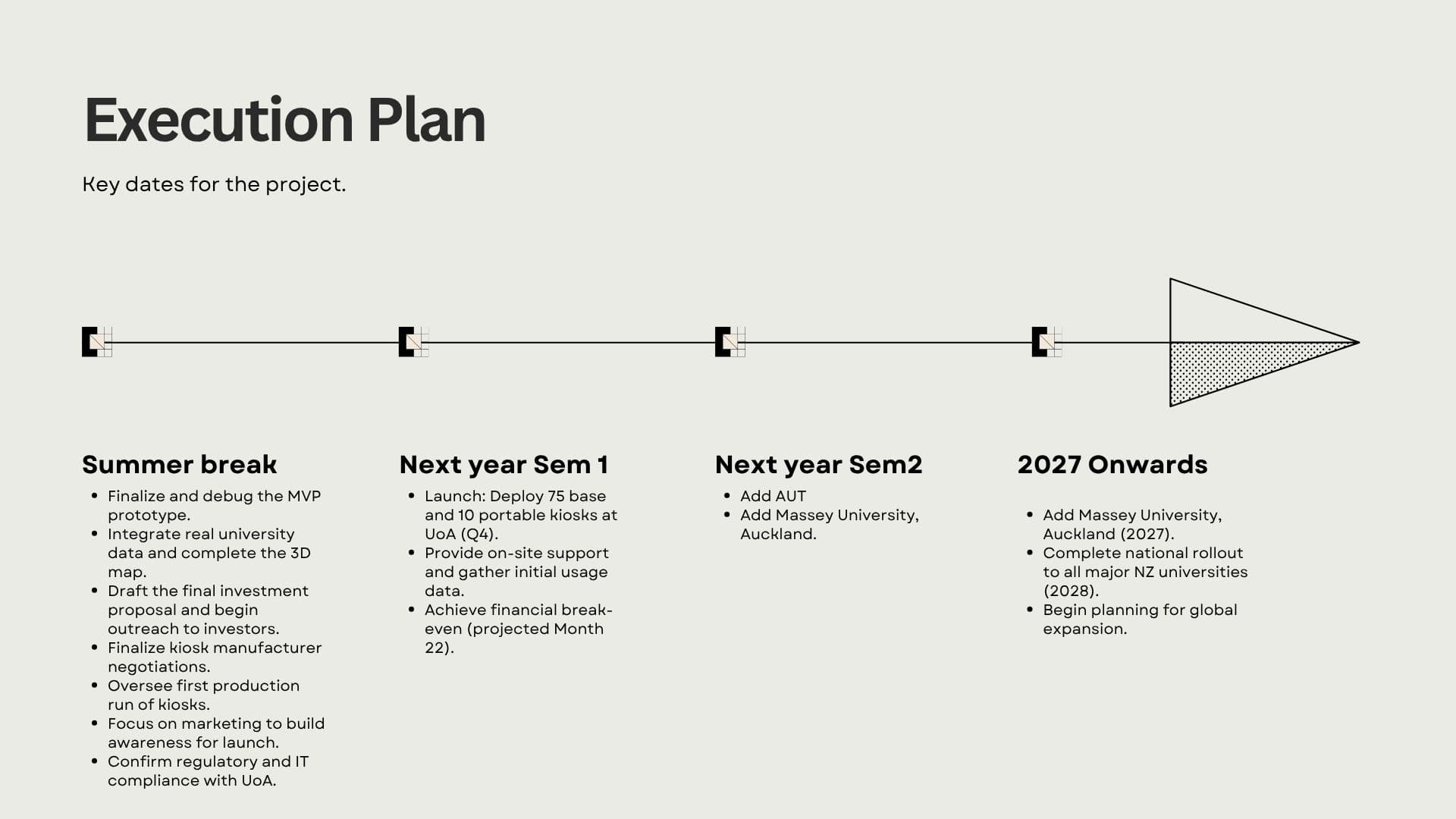
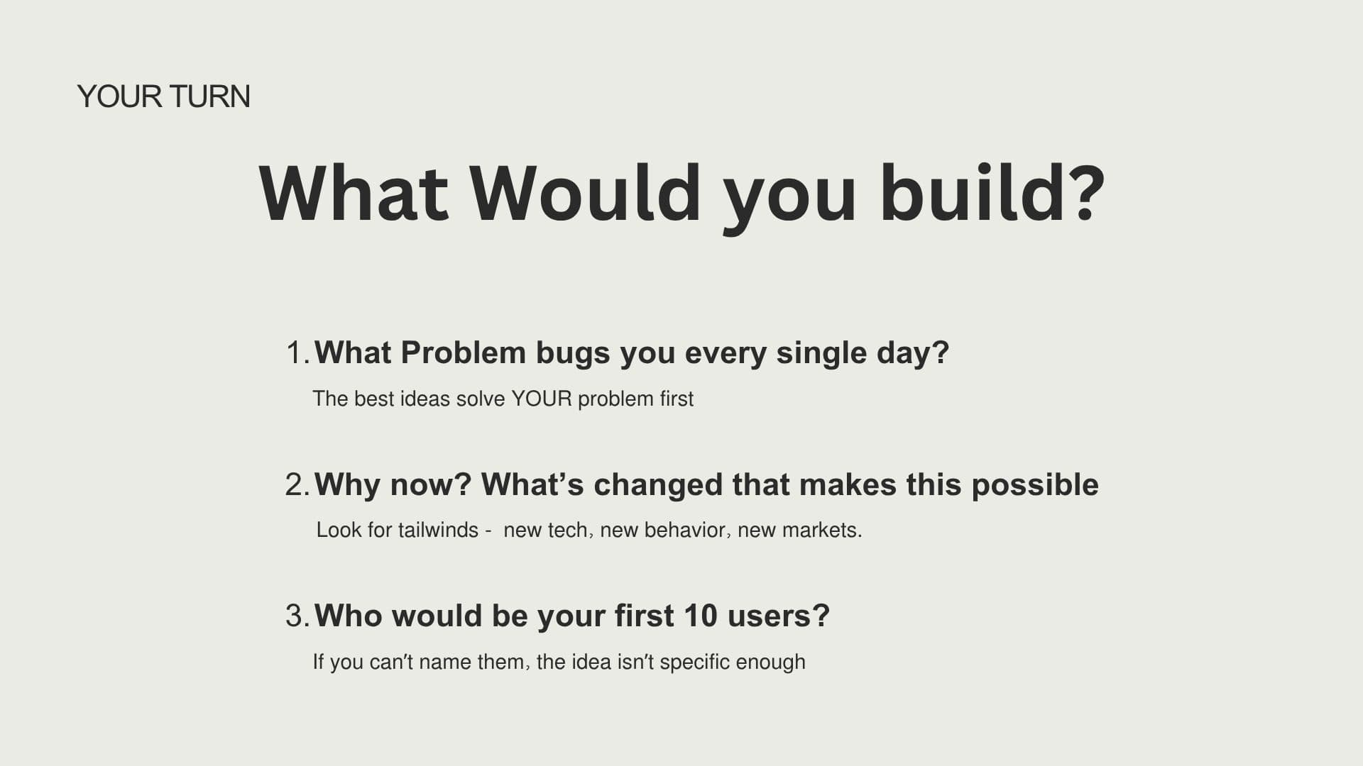
The presentation itself was 33 slides covering a startup framework adapted from Sam Altman's Y Combinator lectures: Idea, Product, Team, Execution, and Luck. For each pillar, I explained the principle and then showed how it played out with my own startup, Unimate — from identifying the campus navigation problem, to building the 3D kiosk, to forming a team with my brother and trusted peers, to iterating through three physical prototypes. I included real data (68% of first-year students get lost on campus, 28% experience navigation anxiety), actual prototype photos, and our team photo. I ended with an interactive activity where I gave the audience three prompts — "What problem bugs you every day?", "Why now?", and "Who would be your first 10 users?" — and gave them a couple of minutes to brainstorm their own startup idea.

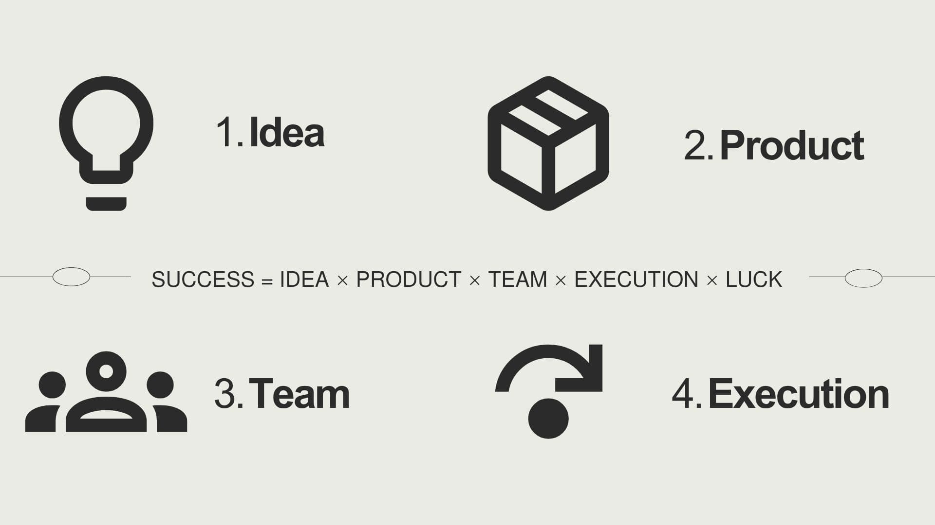
The complete "Start Your Startup" slide deck — covering Idea, Product, Team, Execution, and Luck, with Unimate as the running case study.
Watching peers' demos
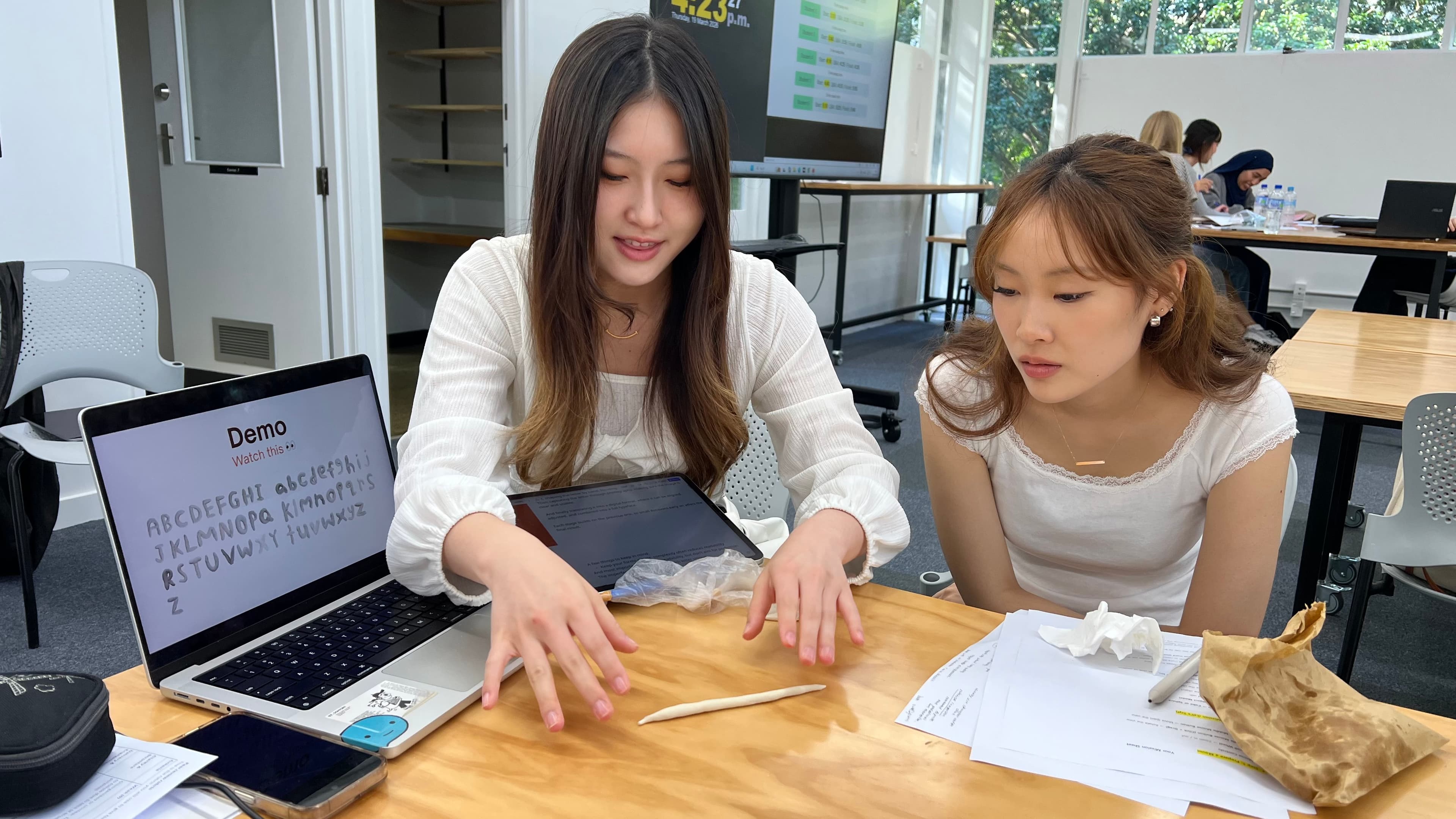
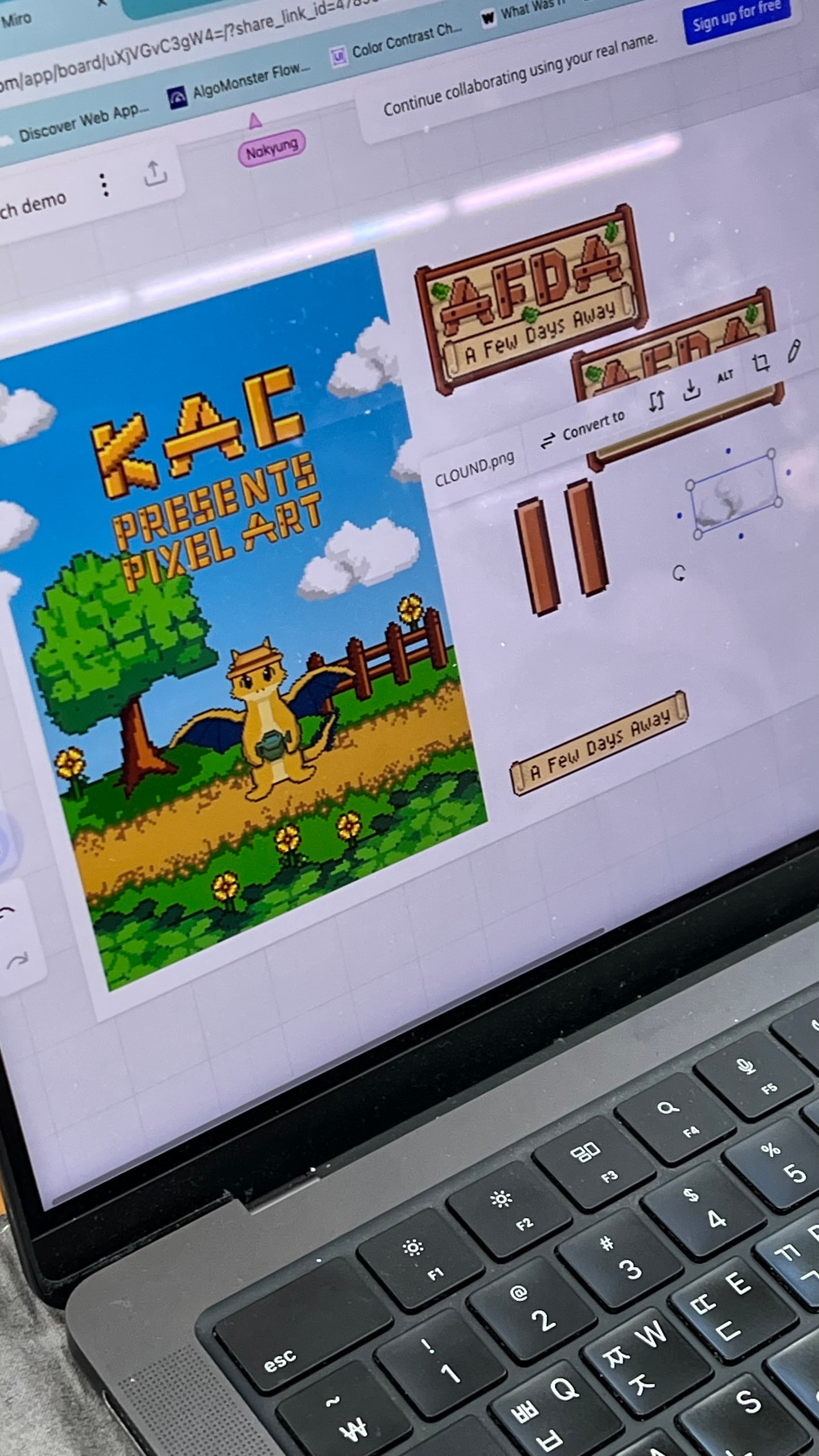
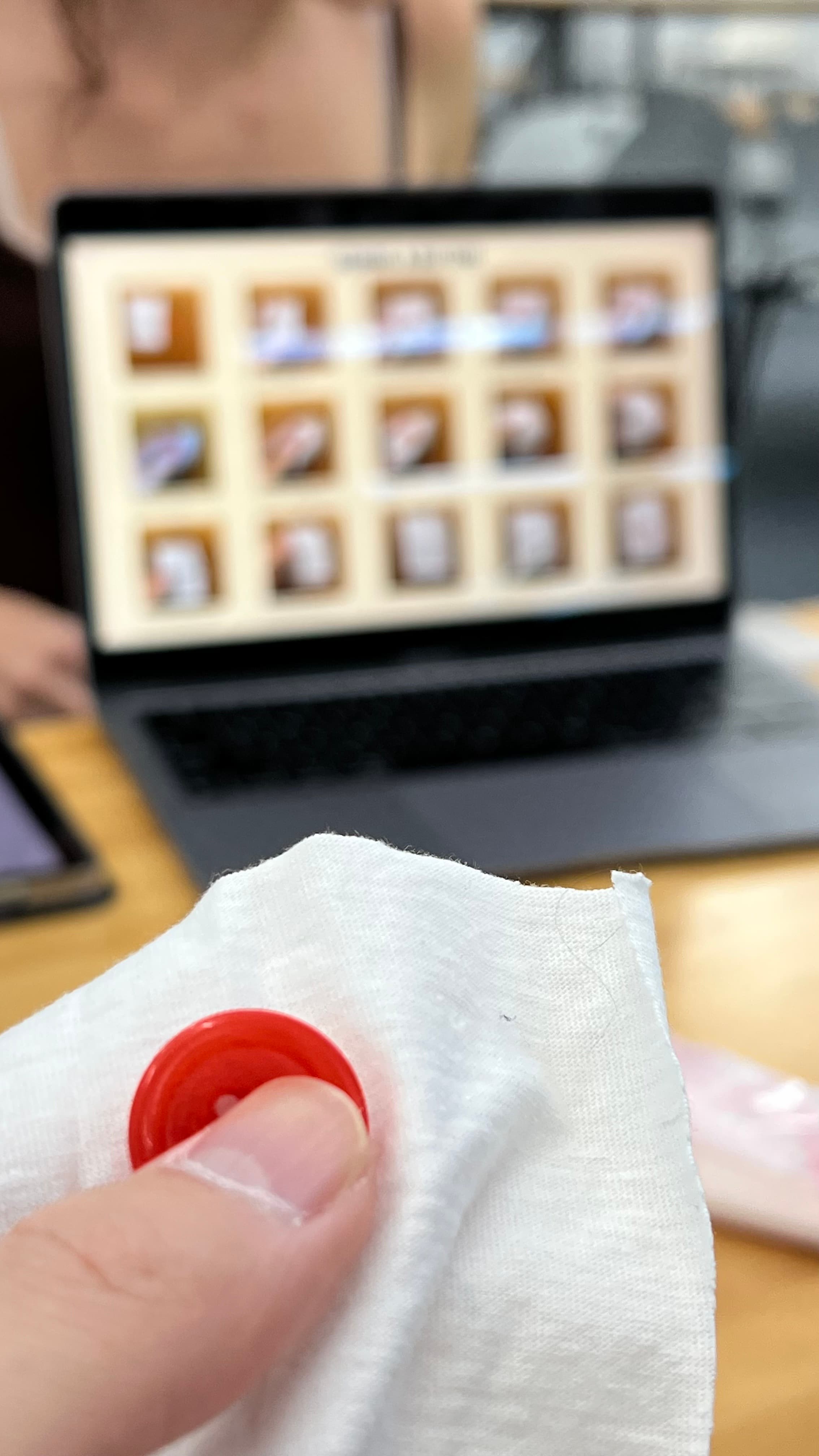
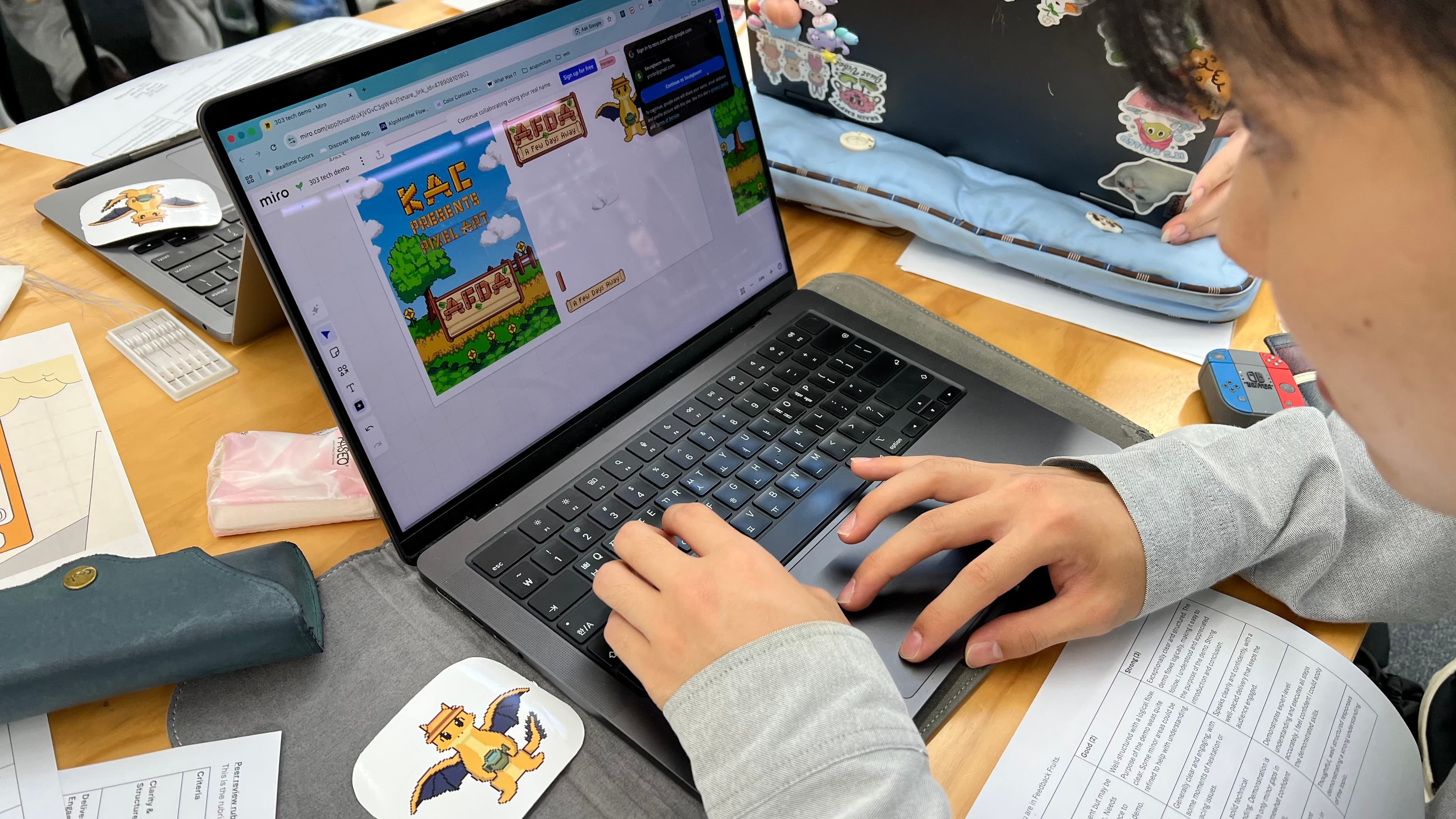
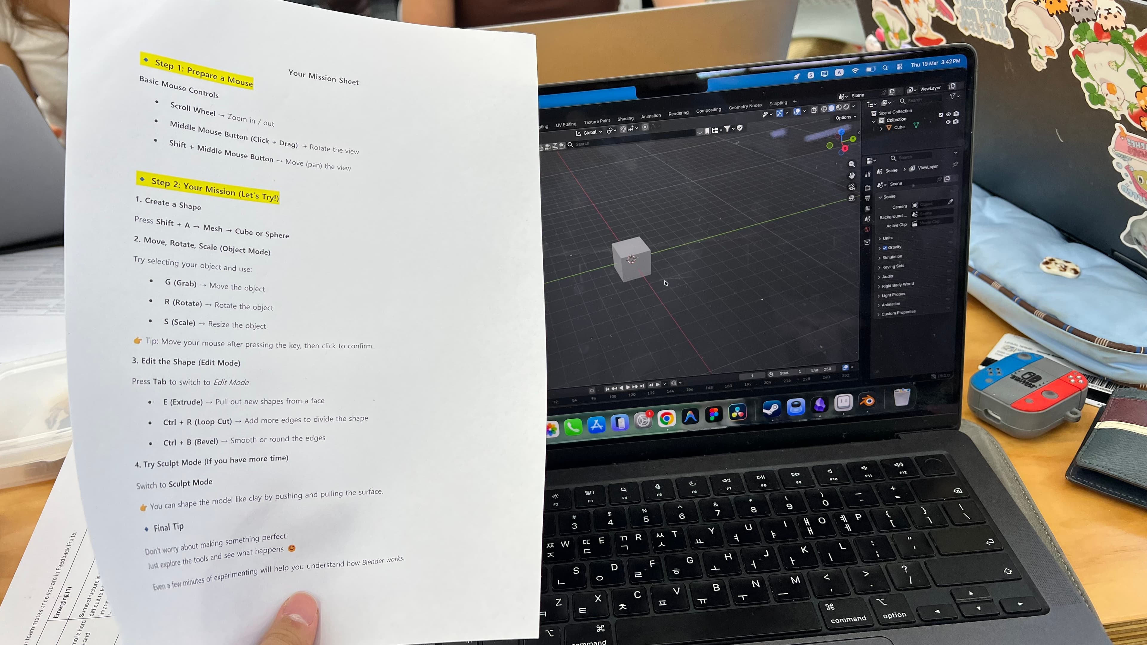
After my presentation, I watched four peers deliver their tech demos. Abby demonstrated hand-sewing techniques, teaching us how to sew a button through a practical exercise. Harrison presented pixel art creation, walking us through the process with polished slides and examples. Hyokyoung gave a demo on Blender, the 3D modelling software, complete with a mission sheet activity. Sarah presented logo design principles, analysing real-world logos and connecting them to our Capstone projects. Nakyung ran a creative session where we physically shaped letters out of dough, photographed them, and explored turning them into downloadable fonts.
I received detailed written feedback from five peers after my demo. The feedback was thorough and covered clarity, delivery, engagement, demo effectiveness, and responses to questions.
Feeling — How did I feel?
The physical environment immediately set the tone. Walking in and realising that 18 groups would be presenting simultaneously, with no microphones, was stressful. I'm confident speaking in front of people — I actually enjoy presenting — but having to shout over the noise of 17 other groups was a completely different challenge. It wasn't about nerves; it was about whether people could physically hear me. Going first added to this because I couldn't observe anyone else's approach or gauge how loud I needed to be before it was my turn.
Once I started presenting, I found my rhythm. The energy came naturally because I genuinely care about the topic. Talking about startups and walking through the Unimate story felt personal and exciting rather than like an assignment. The moments where I saw people nodding or reacting to the data (like the 68% statistic) felt rewarding — it meant the content was landing even through the noise.
However, I could feel myself speeding up. The combination of 33 slides, the time pressure, and the noisy environment pushed me to talk faster than I should have. By the time I got to the Unimate case study section, I knew I was rushing, but I couldn't slow down without cutting content. The interactive activity at the end was the moment I felt most connected to the audience — seeing people actually brainstorm startup ideas made the whole thing feel worthwhile.
Watching my peers' demos, I felt genuinely impressed and, in some cases, inspired. Nakyung's dough letter-making activity was the most memorable because it was hands-on and fun — we were physically making things, which kept energy high even though it was ambitious in scope. Hyokyoung's Blender demo stood out for how well-prepared it was, especially the mission sheet that made the activity structured and achievable. Abby's button-sewing exercise was surprisingly engaging because we were learning a real physical skill. Harrison's pixel art slides were visually polished, and Sarah's logo analysis gave me useful frameworks I could apply to my own work.
Receiving the written feedback was initially a bit confronting. Reading five detailed critiques of your own work is never easy, even when the feedback is constructive. But as I read through them, I realised the feedback was fair, specific, and genuinely helpful. The peers were not just being nice — they pointed out real problems alongside the strengths.
Evaluation — What was good and bad?
- +Content consistently rated as the strongest element — all five reviewers noted well-researched, practical material
- +Confidence and deep knowledge came through clearly — multiple peers noted assured delivery and strong Q&A responses
- +Real-world examples (Airbnb, Google) combined with Unimate case study made content credible and relatable
- +Interactive brainstorming activity was conceptually well-received — peers appreciated the reflective prompts
- -Pacing too fast — the most consistent criticism across all five reviews, especially in information-heavy sections
- -Mid-section structure confused teaching mode with pitching mode — felt like a product pitch rather than a learning session
- -Interactive workshop was under-developed — felt like an add-on rather than a well-structured activity
- -Monochromatic slide design caused visual fatigue — needed an accent colour for emphasis
"Highly engaging — the pitch-like energy suited the startup topic."
STRENGTH
"The reflective questions encouraged deeper thinking."
STRENGTH
"Slides didn't have much supporting text, so it was hard to refer back to points that went by too quickly."
GROWTH AREA
"It felt more like a product pitch than a continuation of the learning content."
GROWTH AREA
Analysis — Why did this happen?
The pacing problem traces back to over-scoping.
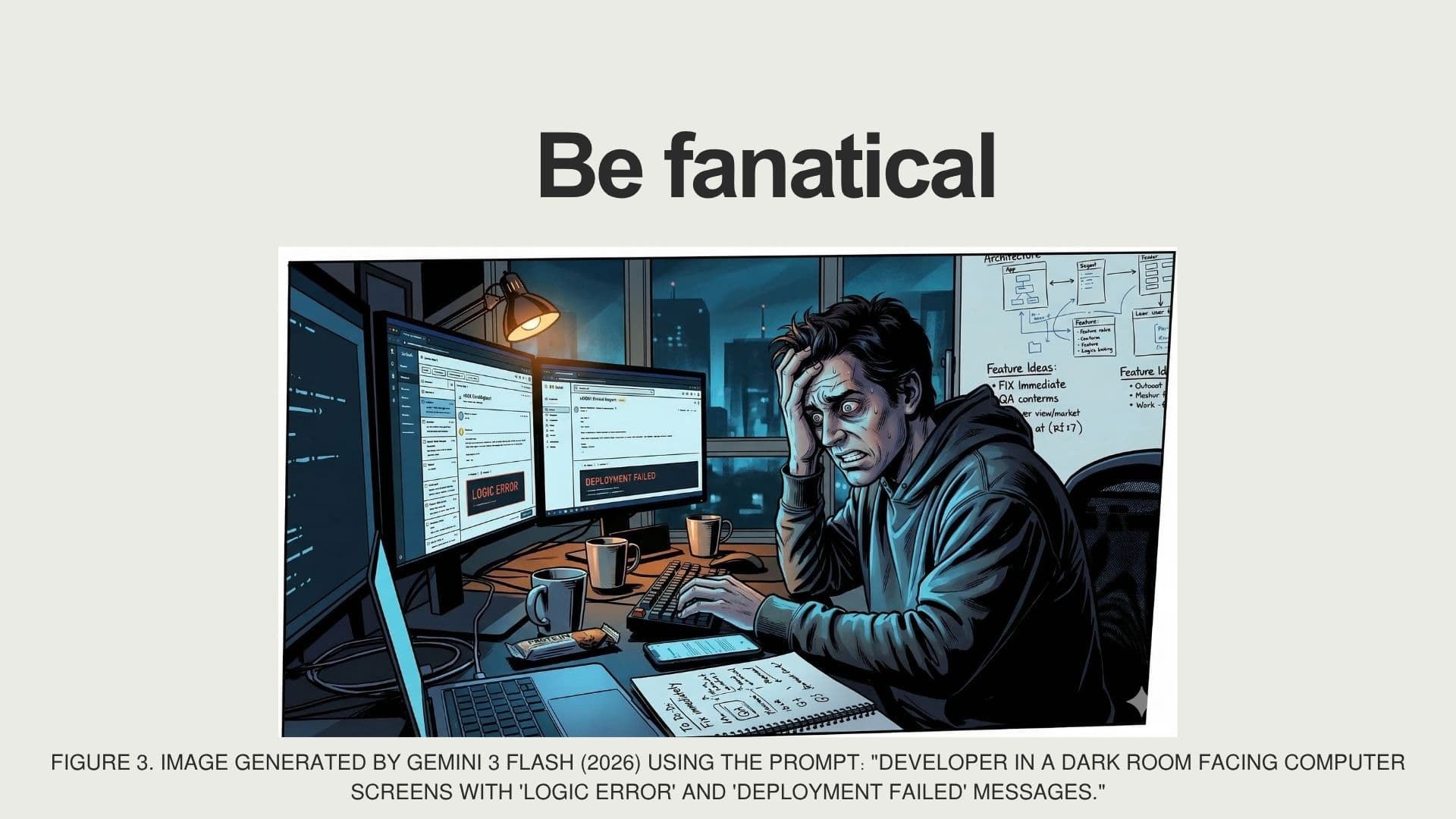
This is the same pattern I identified in Week 2: I tried to fit too much content into the time available. 33 slides in 15 minutes gives roughly 27 seconds per slide, which forces fast talking. The noisy environment made it worse because I was already speaking louder and faster to compensate for the room conditions. The real issue isn't that I talk too fast — it's that I prepare too much content and then compress my delivery to fit it in. If I had prepared 18 slides instead of 33, I wouldn't have needed to rush.
The pitch vs. teaching confusion is about audience framing.
When I present Unimate to investors or university administrators, the goal is persuasion. When I'm using it as a case study in a teaching demo, the goal is illustration. I didn't consciously switch between these modes, which meant some sections came across as selling rather than teaching. This is actually a useful insight about positionality — my natural mode when talking about my own work is pitching, because that's what I've practised most. I need to learn to step back from the product and use it purely as a teaching example when the context calls for it.
The workshop weakness reflects my "maker bias" again.
I spent the vast majority of my preparation time on the slides and content (the making), and very little on designing the interactive activity (the facilitation). In a teaching context, the activity is arguably more important than the lecture — it's where the actual learning happens. I treated it as a nice ending rather than the core of the session.
Watching peers taught me about format matching.
The demos that worked best were the ones where the format matched the content. Nakyung's dough activity was memorable because font-making is a physical, creative process, and she made us physically create. Hyokyoung's mission sheet worked because Blender is software you learn by doing, and she structured the doing. My demo was a lecture about a practical topic — the format didn't match the content.
The environment factor is worth analysing honestly.
18 groups presenting simultaneously with no microphones is a genuinely difficult setup. But some presenters adapted better than others. Nakyung's hands-on activity worked well in the noisy environment precisely because it didn't rely on the audience listening — it relied on them doing. Hyokyoung's mission sheet worked because the instructions were written down. My presentation was almost entirely verbal, which made it maximally vulnerable to the noise problem. This is another lesson in design: design for the worst-case environment, not the ideal one.
The medium is part of the message. If I'm teaching entrepreneurial thinking, the activity shouldn't be "answer three questions on your phone" — it should be more like "identify a problem in this room and sketch a solution in 5 minutes." That kind of active, time-pressured, creative exercise would embody the startup mindset rather than just describe it.
Conclusion — What can I learn?
The most important takeaway is the gap between content quality and delivery quality. My content was strong — every reviewer confirmed that. But strong content delivered too fast, in a noisy room, with an under-developed activity, still results in a less effective learning experience. Knowing things and communicating things are different skills, and I need to invest more time in the communication side.
From peer feedback, I've learnt two specific things I'd change. First, I'd restructure the balance between lecture and activity. Instead of 12 minutes of talking followed by 3 minutes of brainstorming, I'd aim for something like 7 minutes of context, 5 minutes of structured activity, and 3 minutes of discussion. The activity should be the centrepiece, not the postscript.
Second, I need to clearly separate "teaching with a case study" from "pitching a product." These are different communication modes, and switching between them without signposting confuses the audience. A simple framing statement like "I'm going to use my own startup as an example to illustrate these principles" at the transition point would have solved this.
From watching peers, I've gained two insights I want to apply going forward. From Nakyung: physical, hands-on activities create engagement that survives a bad environment. Even in a noisy room, people stay focused when they're making something. From Hyokyoung: written materials (like her mission sheet) reduce the audience's dependence on hearing every spoken word. Supporting materials aren't a crutch — they're good design.
Action Plan — What will I do differently?
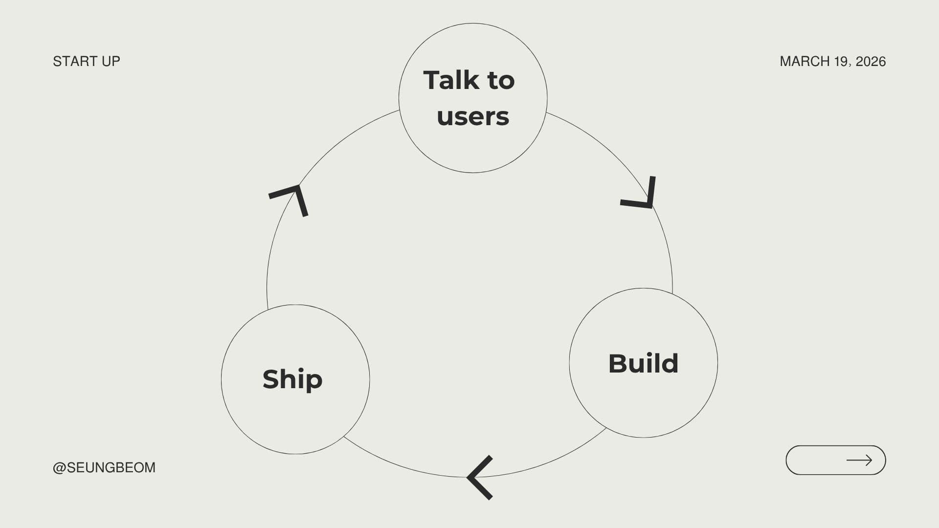
Looking ahead: I'll carry these lessons about communication, facilitation, and audience-centred design into my DES303 experiments and Capstone direction.
References
Altman, S. (2014). How to Start a Startup: Lecture 1 — How to Start a Startup [Video lecture]. Y Combinator / Stanford University. Retrieved from https://www.youtube.com/watch?v=CBYhVcO4WgI
Lipmanowicz, H. & McCandless, K. (n.d.). Liberating Structures — Introduction. Retrieved from https://www.liberatingstructures.com/
Reynolds, G. (2012). Presentation Zen: Simple Ideas on Presentation Design and Delivery (2nd ed.). New Riders.
TED. (n.d.). TED speaker guide. Retrieved from https://www.ted.com/participate/organize-a-local-tedx-event/tedx-organizer-guide/speakers-program/prepare-your-speaker