DES303 Week 5: Turning Tickers into a Running Prototype Through Arena Design, Focus Integrity, and Cross-Device Testing
Introduction
Week 5 was the point where Tickers started moving from a speculative concept into a more believable and testable system. In Week 4, I used low-fidelity wireframes to test the central tension of the project: whether a productivity-support system could feel helpful on the surface while also normalising monitoring, pressure, and judgement underneath. That early work was useful for clarifying the core idea, but it was still limited. The prototype had logic, but it did not yet have a convincing emotional tone, and it did not yet reflect the actual devices through which the system would need to operate.
This week, I wanted to continue prototyping by testing the project in a more realistic form. The most important part of Tickers is not only the interface, but the way the arena feature and the focus-integrity feature work together. The arena uses connection, commitment, nudging, and social pressure to make users more focused through accountability. Focus integrity then makes that accountability more serious by trying to verify whether the user is actually working. Together, these two parts create the strongest tension in the project: a system that helps people focus, but also makes them feel watched. The Week 5 material also stresses that this stage should involve both continued making and clear crit preparation, rather than treating the prototype as finished too early.
To do that, I moved from low-fidelity structure into visual precedent research, adopted a stronger design direction using CRED and NeoPOP as visual precedents, expanded the prototype from mobile-only into a cross-device system, and began implementing it through Flutter and Django. I also uploaded the app to TestFlight and tested it with around ten people, which exposed problems that would never have shown up in static mockups. By the end of the week, Tickers had become more coherent, more believable, and much harder to treat as a neutral productivity idea.
This week's experiment was not about finishing Tickers as a full app. It was about testing whether the concept could become believable as a cross-device speculative system. The core question was: can Tickers make focus feel like a social commitment rather than a private task? I tested this by connecting the mobile arena layer, the desktop focus-integrity tracker, and backend sync into one prototype. If the prototype worked, focus would no longer feel like something the user privately completes. It would become something declared, tracked, challenged, and socially judged.
- What I was testingWhether the arena and focus-integrity layers could make productivity feel social, scored, verified, and uncomfortable.
- What I was not testing yetFinal algorithm accuracy, anti-cheat robustness, full privacy consent, real money, full security, or long-term behaviour change.
- Success criteriaThe prototype would be useful if people could understand that Tickers is not only a timer, but a system where focus becomes public proof.
The Experience
From low-fidelity wireframes to a stronger visual direction
My starting point this week was the low-fidelity wireframe work from Week 4. Those wireframes helped me define the basic structure of Tickers, especially the relationship between focus tracking, social accountability, and behavioural scoring. They were useful for testing system logic but not for testing emotional reading. At that stage, I could ask whether the concept made sense, but I could not yet tell how persuasive, attractive, or unsettling it would feel once it started looking like a real app.
I was particularly drawn to the CRED app and the NeoPOP design system, which I used as visual precedents for a stronger design direction. I discuss that precedent work in more detail in the following section.
Precedent analysis and behavioural references
As the prototype moved beyond low-fidelity wireframes, I also looked more closely at existing apps and behavioural patterns that could help me understand how Tickers should feel and function. On the productivity side, I looked at apps such as Todoist and TickTick to understand how task systems reduce friction, structure goals, and make repeated use feel manageable rather than overwhelming. I also looked at Todomate, which was useful because it brought in a stronger sense of social accountability and emotional connection around task completion. These precedents helped me think more clearly about how a productivity system can be made usable, motivating, and habit-forming before it becomes overtly controlling. Alongside these, I used CRED and the NeoPOP design system as visual precedents. What interested me there was the bold contrast, strong hierarchy, reward-oriented polish, and game-like atmosphere. That direction felt especially relevant because Tickers is not just a task manager — it is a social and psychological system built around commitment, pressure, reward, and risk.


- Contrast & hierarchyHigh-contrast blocks and decisive typographic hierarchy make every action feel deliberate.
- Reward-oriented surfacesPolished reward summaries and status cards make progress feel earned and collectible.
- Game-like intensityDepth, edges, and state changes borrow from gaming — motivating without feeling childish.
- Trust through finishHigh finish reads as seriousness, which is exactly what makes behavioural logics feel legitimate.
I also began thinking more intentionally about the behavioural logic behind the arena feature. The arena works by using connection and social visibility as a form of motivation. Instead of relying only on self-discipline, it introduces commitment, accountability, nudging, proof, and the risk of being challenged. Reading Thaler and Sunstein's Nudge alongside this helped me think more deliberately about how public commitment, proof, and the possibility of challenge could work together as behavioural pressure rather than as separate app features. That makes the system more engaging, but also more ethically uncomfortable, because the same mechanisms that help users focus can also make them feel watched or pressured. This behavioural framing became especially important once I began developing the focus integrity feature. Together, the arena and focus integrity started to feel less like separate functions and more like two parts of the same system: one uses social connection to increase focus, and the other verifies whether that focus is real. This precedent and psychology work therefore did not just inform the style of the interface. It directly shaped the structure of the prototype and the kind of tension I was testing.
First mid-fidelity pass in NeoPOP
Before committing to a full arena flow, I did a quick first pass applying the NeoPOP direction to four screens I considered central to the system — the to-do page, the arena rooms list, the in-arena state, and the win screen. This was deliberately rough and mid-fidelity. The goal was to see whether the visual language held up as soon as it hit real productivity content, or whether it started feeling decorative before the system had any depth behind it.


That first pass taught me two things quickly. First, the reward tone carried the win screen cleanly — NeoPOP is genuinely good at making outcomes feel earned. The arena rooms list also held up once the hierarchy was given room to breathe. Second, the in-arena and to-do screens started to feel over-styled relative to the behavioural load they were carrying. I was stacking contrast and depth without asking whether each element served the focus-versus-surveillance reading I actually wanted. That told me to pull back, simplify hierarchy, and then commit to a more careful full flow rather than keep decorating isolated screens.
Expanding the prototype into the arena flow
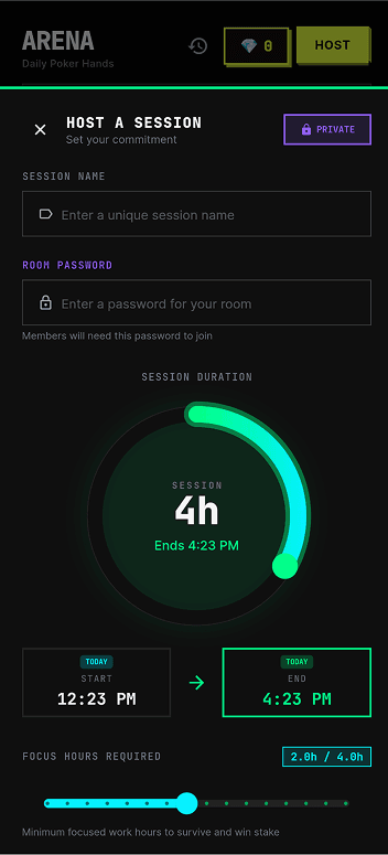
With that first pass as a reference, I expanded the arena into a fuller prototype flow. Rather than showing only isolated interface moments, I designed and connected a wider set of screens that demonstrated how the system works as an experience over time. These included the room list, room lobby, bet-posting screen, live room state, proof submission, bluff challenge, and outcome / recap screen.
The room list and room lobby show how users are drawn into a social environment structured by quotas, seats, buy-ins, and rules. The bet-posting screen makes that more personal by forcing the user to formalise work into commitments with risk attached. The live room screen then shifts the prototype into a public space of visibility, where participants, pots, statuses, and updates make focus into something collectively monitored. The proof submission and bluff challenge screens reveal that the arena is not just playful motivation — it depends on evidence, scrutiny, and the possibility of being challenged by others. The outcome screen completes the cycle by translating survival, busts, and partial wins into a polished reward summary.
Designing this flow made the prototype much easier to understand. More importantly, it also made the system logic harder to avoid. Once the full arena sequence existed, the concept no longer relied on explanation alone. The user journey itself began to reveal how connection is being used as a productivity-enforcing tool.
This arena flow was testing whether connection can become pressure. A normal focus timer only asks the user to manage themselves. The arena makes other people part of that process. They can see the user's commitment, wait for proof, challenge suspicious behaviour, and respond to the outcome. This means the prototype is not only testing a game mechanic. It is testing whether social connection can become a productivity-enforcing system.


From mobile-only to a cross-device system
One of the biggest changes this week was architectural rather than purely visual. Earlier in the project, Tickers was mostly framed as a mobile experience because mobile was the fastest surface for wireframing and social flow design. As I developed the focus-integrity side more seriously, I realised that a phone-only prototype could not test the concept properly. If the user is actually doing work on a laptop or desktop, the phone cannot meaningfully verify what they are doing. That made the earlier architecture feel inadequate.
Mobile still made sense for the arena's social layer — browsing rooms, posting bets, checking updates, submitting proof, and seeing outcomes — but focus integrity needed to live closer to the actual work device. I therefore expanded the prototype so that the desktop, specifically macOS, became the place where focus integrity operates. This is where signals such as camera / face presence, active tab or window context, and task-related behaviour could be monitored more believably.
That change also forced a broader architecture shift. The earlier version of the prototype leaned toward a local or offline-biased structure. Once the arena became a live multi-user system, that no longer made sense. Bets, bluff calls, proof state, synced session outcomes, and live room updates all depend on shared state between users and devices. The project therefore shifted into a more hybrid synced architecture. I implemented the current version using Flutter on the interface side and Django on the backend side, with a push-and-sync structure so room states and session information could move across devices. The goal of the architecture at this stage was not to build the final product — it was to make the concept testable enough that the arena and focus-integrity layers could actually affect each other.
Moving to a desktop tracker changed the experiment. A phone-only prototype could only ask users to report that they focused. A desktop tracker tries to prove whether they focused. That shift made the project more interesting because proof requires evidence. Once evidence is involved, the project starts raising questions about accuracy, privacy, consent, and trust.
- 1User → Phone: Tap “Start focus”
- 2Phone: Start timer
- 3Phone → User: Show countdown
- 4Phone: Timer ends
- 5Phone → Local storage: Save session
- 6Phone → User: “Done”
- — nothing between “tap start” and “save” verifies what the user actually does —
One device, one timer, no verification — the user's word was the whole system.
- 1User → Phone: Declare task · buy in · take seat
- 2Phone → Backend: Create session
- 3Backend → Others: FCM push — “room is live”
- 4User → Desktop: Start focus on work device
- LOOP · every few seconds
- Desktop collects signals (window · face · input · screen diff)
- if ambiguous: Desktop → Backend
/judge→ verdict - if clear: Desktop decides locally
- Desktop → Backend: integrity score + violations
- Backend → Others: live state via FCM
- 5User → Phone: End session · submit proof
- 6Phone → Backend: Proof + session ref
- 7Others → Phone: Call bluff?
- 8Phone → Backend: Evaluate with integrity score
- 9Backend → Phone: Outcome · payout
- 10Backend → Others: Final recap via FCM
Declared intent on the phone, behavioural verification on the desktop, shared truth on the backend, live updates to other players — the user's word is just the start of the system.
- Arena rooms
- Bets · proof · bluff
- Outcomes
- Room state
- Session records
- Payouts
- Focus session
- Camera · window · task
- Integrity score
The data model clusters around two centres. The user side owns tasks, a wallet, device tokens, and focus sessions. The arena side is a room-centric graph: a Table hosts Seats, each seat declares Missions, and each mission can collect TaskConfirmations (proof) and BluffChallenges before a Payout resolves it. The bridge between the two sides is the optional foreign key FocusSession.arena_seat — that single edge is what allows a verified focus session on someone's desktop to count as progress inside a social room on their phone.
Building and testing the prototype
After establishing the design and architecture direction, I started coding the system. I used Flutter for the front-end app and Django for the backend. On the focus-integrity side, I began implementing a score that uses multiple signals rather than a simple timer — camera / face presence, active tab or window context, and a lightweight AI judge layer. The AI judge is partly working at this stage. It can recognise some patterns but is still unstable and behaves inconsistently enough that I would only describe it as an emerging component rather than a resolved one. That uncertainty is actually useful, because it shows where the boundary currently sits between concept and system.
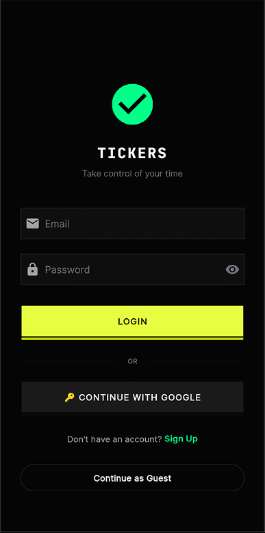
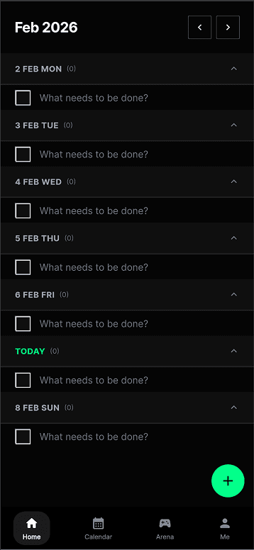
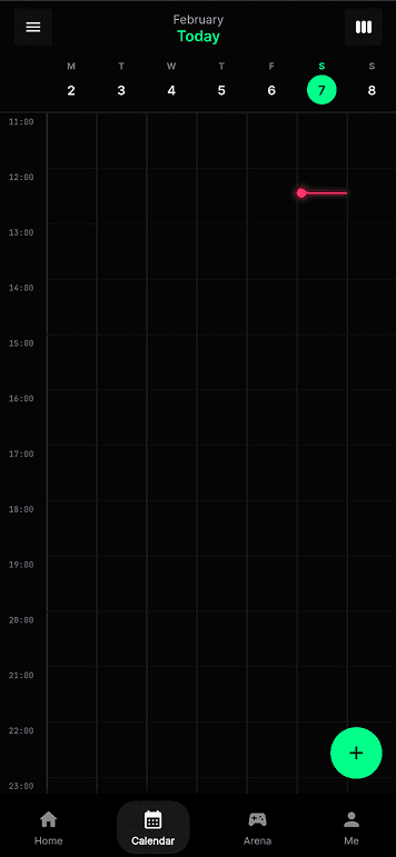
I also uploaded the app to TestFlight and tested it with around ten people. This changed the prototype significantly, because it stopped being something I could reason about alone. A few problems made this especially clear. Duplicate session records could appear because of lifecycle issues. Auto-end could behave unreliably while the app was backgrounded. Night mode could break mid-pomo when different subsystems interfered with each other. There were also moments when the macOS session state and the phone session state drifted apart, breaking the link between the focus-integrity layer and the social arena layer. Debugging was frustrating because every broken test session also cost my friends time and patience. The screens below are captured directly from the Flutter build — what the TestFlight users actually saw as they moved through login, to-do, calendar, and the two arena-creation flows.
These failures were useful because they showed that focus-integrity correctness is not only a technical issue. If the system creates duplicate sessions or loses sync between phone and desktop, users cannot trust the score, the proof, or the arena outcome. The experiment therefore revealed that trust is part of the design problem.


How focus integrity actually works
Focus integrity isn't a binary “are you working?” — it's a layered decision that escalates only when it has to. The desktop collects cheap behavioural signals every few seconds: which window is active, whether the user is typing, whether a face is in front of the camera, whether the screen has changed since the last tick. Most of the time these signals are clear enough to decide locally — a banned app is off-task, a task-keyword match is on-task, idle-plus-face-absent is AFK. When the signals are ambiguous, the client calls the backend's AI judge, which uses a lightweight text-based model for low-cost classification. Only if that judge itself asks for vision does the system capture a screenshot and escalate to the vision model. Every decision feeds an integrity score (0–100), a timeline, and a list of violation events, which together determine whether a session is valid, warned, or auto-stopped — and ultimately whether the arena trusts the proof the user submits.
- — Declared task is authoritative
- — Banned apps (YouTube, Netflix, TikTok, games) are off-task regardless of other signals
- — Idle + face-absent is AFK, treated as off-task
- — Passive tasks allow low input activity
- — Neutral apps with no task-keyword match are ambiguous — vision escalation happens here
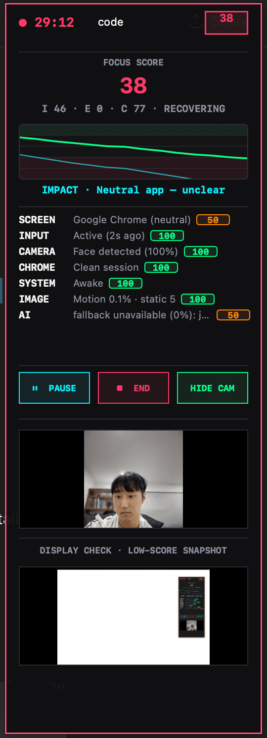
At this stage, focus integrity should be understood as a confidence system, not as truth. The score estimates whether a session appears task-aligned based on available evidence. It can still misread context. This matters because if the interface presents the score as absolute, it becomes unfair very quickly. If it presents the score as uncertain, explainable, and contestable, then the system becomes more believable and more ethically interesting.
Architecture diagrams freeze the system — they show what exists, not what it does. The sequence makes three things visible that matter for the concept. First, cost-aware escalation: most ticks are decided locally and never hit the AI; the judge is called only when signals are ambiguous, and vision only when the judge asks for it. Second, continuous vs punctual evidence: integrity is produced every few seconds across the whole session, but proof is a single moment at the end — the arena's job is to weigh the moment against the continuous record. Third, multi-actor causality: a single user action (tap end, submit proof) sets off parallel work across the backend, the AI, and other players' phones via FCM, and the diagram makes those parallel lanes legible.
What this made clear to me is that technical complexity is not just a build problem in Tickers — it is part of what makes the speculative condition believable, because the system only works when accountability is distributed across devices, backend logic, and other users.
- 01Duplicate session recordsLifecycle issues produced duplicate session entries, making recaps and quotas unreliable.
- 02Unreliable auto-endSessions did not always end cleanly while the app was backgrounded on mobile.
- 03Night mode breaking mid-pomoSubsystems interfering with each other caused theme state to fail mid-session.
- 04Mobile–macOS state driftSession state between phone and desktop occasionally fell out of sync, breaking the link between social arena and focus-integrity layers.
Reflection on Action
The most important thing I learned this week is that fidelity changes meaning. In Week 4, I was mainly testing whether the idea of Tickers made conceptual sense. In Week 5, I started testing what happens when that same idea becomes polished, functional, and believable. That shift changed the project significantly.
The first big change came from the visual direction. Using CRED and NeoPOP as precedents helped Tickers feel much more coherent and much more persuasive. The arena started to feel exciting, structured, and legible. That was useful because it made the prototype feel like something people might actually want to use. At the same time, that was also what made it more uncomfortable. The more attractive the interface became, the easier it was to imagine the system normalising itself through motivation, excitement, and reward. The design language is not neutral — it actively shapes whether the concept reads as supportive, seductive, manipulative, or critical.
The second big change came from architecture. Once I moved from a mobile-only idea to a cross-device setup, the focus-integrity system stopped being speculative in the abstract and became much more concrete. Verified focus was no longer just described; it became a running mechanic where signals could be read, judged, and turned into consequences for arena participation. The arena and focus-integrity features now reinforce each other in a way that feels much closer to the actual concept I had in mind: connection being used to motivate focus, and focus being validated through watching.
What was harder than expected was the cost of that realism. Once the system became live, time-based, and multi-user, testing became slow and frustrating. Debugging no longer only affected me — it affected the whole social loop of the app. I also noticed again that I tend to overbuild once the prototype starts working. This also reflects my own positionality as a designer, because once a concept starts making sense I naturally move towards building systems and infrastructure rather than staying with a smaller experimental probe. That helps me prototype quickly, but it also risks pushing the project towards technical completion before I have fully tested the most important uncertainty. There was a constant temptation to keep improving the full system rather than keep asking what single quality I still most need to learn about. The Week 5 guidance is useful here because it reminds me that an early prototype is not the full project and should not try to test everything at once.
This week also taught me something more specific about the concept itself. The arena works because it uses connection, commitment, and psychological nudging to make people focus harder. Focus integrity works because it turns that motivation into something monitored and verified. The project becomes strongest when those two layers are combined — and that is also where it becomes most ethically uncomfortable. The more effectively the app helps people focus, the more it also risks making surveillance feel normal.
- —Tests whether the idea makes sense
- —Logic without emotional tone
- —Isolated screens, no live state
- —Concept readable by me, not by others
- +Tests what polish does to the meaning
- +Reward-oriented tone makes critique sharper
- +Live multi-user sessions with synced state
- +Concept readable through the journey itself
Theory
This week's prototyping direction still fits strongly with the brief. The DES304 stream is asking for a plausible future condition shaped by emerging technologies, and for speculative artefacts or systems that make socio-technical change tangible enough to be questioned. Tickers is becoming stronger as a response to that brief precisely because it is no longer only an idea about productivity. It is becoming a more believable artefact that demonstrates how support, social connection, reward, and surveillance could merge inside one everyday system.
The Week 5 material also helped clarify why the prototype needed to develop in this direction. A strong prototype at this stage is not supposed to test everything. It should focus on what matters most now, what is most uncertain, and what can realistically be learned through making. For me, that uncertainty was no longer “does the concept exist?” It had shifted into “what happens when the system becomes visually attractive, socially functional, and technically believable?” That is why the move into precedent-driven design, cross-device architecture, and real testing made sense.
The visual precedent research also mattered conceptually, not just aesthetically. One of the key themes I identified in Week 4 was that harmful systems often become normal not through force, but through usefulness, care, and desirability. By moving Tickers into a CRED / NeoPOP-inspired direction, I was able to test that mechanism more directly. The more polished and reward-oriented the interface became, the more clearly I could see how the concept depends on attraction as much as enforcement. More broadly, the precedent analysis helped me see that Tickers needed to borrow not just the visual confidence of reward-driven apps, but also the behavioural structure of productivity and accountability systems already normalised in everyday use.
Finally, the architecture shift also has a theoretical side. Moving from a mostly local prototype into a synced cross-device system is not just an engineering decision. It reflects the kind of socio-technical environment the project is imagining. Systems like Tickers do not belong to one screen or one moment — they live through connected devices, background signals, shared states, and distributed judgement. That made the hybrid architecture more than a technical solution. It became part of the speculative condition itself.
Preparation
The next step is to bring this more developed version of Tickers into the Week 6 crit without presenting it as a resolved final product. The Week 5 material makes it clear that crit should not become pure show-and-tell — it should focus on what was tested, what was observed, what seems promising, and what should happen next.
For the crit, I plan to bring the progression from low-fidelity wireframes to visual precedents to the current higher-fidelity and coded prototype. I want to show the arena flow clearly enough that others can understand the system without needing every technical detail explained. During the crit, I will collect feedback through written notes organised into three categories: what feels strongest, what feels confusing or too heavy, and what should be simplified or tested next. After the session, I will use those notes to decide which part of the prototype should be refined first. I also want to include the cross-device architecture and the focus-integrity logic, because those now affect the meaning of the prototype in a major way.
- Q01
Does Tickers read as a speculative future culture, or does it still read too much like a normal productivity app?
- Q02
Does the arena make connection feel motivating, or does it make connection feel like pressure and control?
- Q03
Does the focus-integrity system feel believable enough to support the concept, even if it is not technically final?
- Q04
What privacy or security concerns appear immediately, especially around camera presence, screen evidence, and stored proof?
- Q05
Should the project move away from money-like stakes and towards proof, privacy, reputation, or trust?
- Q06
What should I simplify before the next experiment?
Being clear about what I am not testing yet
I also need to be explicit about the current limits of the prototype, so crit does not end up debating something I am not yet claiming. Being clear about these limits will help keep the feedback focused on the right questions instead of making it sound like I am claiming a finished product.
- 01Final AI accuracyThe AI judge is still an emerging component. It recognises some patterns but behaves inconsistently, so I treated it as a confidence signal rather than a resolved decision-maker.
- 02Anti-cheat robustnessI was not yet testing the system against adversarial users actively trying to game the integrity score, bluff challenge, or proof flow.
- 03Privacy consent and stored proofCamera presence, screen evidence, and saved proof were used to make the concept testable, but the final consent model and data-handling rules were not solved yet.
- 04Real money or full securityThe buy-in and payout logic was tested as a speculative pressure mechanic, not as a financial system with production-grade security.
- 05Long-term behavioural effectsI was not yet testing whether verified focus genuinely changes habits, wellbeing, or productivity over time.
- 06Final architectureThe current Flutter + Django + push-sync setup is a working prototype, not a consolidated production architecture.
Conclusion
Week 5 was important because it turned Tickers from a structured concept into a much more believable prototype. By moving from low-fidelity wireframes into a precedent-driven visual direction, then into a cross-device architecture and an early coded system, I was able to test not only how the app works, but how it feels. The most useful insight from this week is that the arena feature and the focus-integrity feature become much stronger when they are combined. The arena uses connection and nudging to increase focus. Focus integrity then makes that process more serious by verifying behaviour. Together they create a system that can genuinely help people concentrate, while also making them feel watched in the process.
That is the space the project now sits in most clearly. The more believable and effective Tickers becomes, the more it exposes the uncomfortable possibility that behavioural control can be accepted when it is wrapped in motivation, reward, and connection. My next step is to use crit to decide which parts of the current prototype are expressing that tension most clearly, and where the next iteration should become more focused.
References
- Baldwin-Ramult, L. (2026). DES304: Emerging Technologies stream brief [Course brief, University of Auckland].
- CRED. (2026). NeoPOP design system. https://cred.club/neopop
- Design Research Practice. (2026). Week 5 blog guide [Course handout, University of Auckland].
- Doist. (2026). Todoist [Mobile / desktop app]. https://todoist.com
- TickTick Team. (2026). TickTick [Mobile / desktop app]. https://ticktick.com
- Todomate. (2026). Todomate [Mobile app]. https://www.todomate.net
- Thaler, R. H., & Sunstein, C. R. (2008). Nudge: Improving decisions about health, wealth, and happiness. Yale University Press.
Note on figures: Figures 2, 5, 6, 7, 10, and 12–17 were composed by the author as comparison boards, architecture diagrams, process maps, and reflection frames. Figure 1 shows third-party reference captures from the CRED (iOS) app used as visual precedents. Mid-fidelity and wireframe screens (Figures 3, 4, and 9) were created by the author for the Tickers prototype. Figure 8 shows screens captured from the author's Flutter build shipped to TestFlight. Figure 11 is a live screenshot of the author's macOS focus-tracker HUD while running.